For User Experience Designers, effective communication is the core of our craft. Mastering the right vocabulary to discuss designs and features is crucial when collaborating with diverse teams and stakeholders. Let’s explore some essential terms that will elevate your design discussions and presentations, allowing you to be confident in your expertise. 🚀
🪑 Affordances
Affordances refer to the possible actions that a user can readily perceive from an element. They allow users to discover “what can be done” with a design. They should allude to meaningful or useful actions that your users can take.
Elevator buttons afford being pressed.
Chairs afford being sat on.
🎨 Signifiers
Signifiers are perceptible cues that designers can include in interfaces so users easily know what to do. Signifiers optimize affordances by indicating where and how to take an action. This can include colours, signs, fonts and sounds to guide users on how to interact with specific features.
A greyed out button signifies that it is inactive.
💾 Standards
Standards or norms rely on shared expectations and explicit guidelines that dictate how certain features should look and function. This can be different based on cultural and regional contexts. Designers should always consider the context of usage and make use of standards.
The floppy disk is no longer used, but is still used as an icon. Just look at Microsoft Word.
Constraints are aspects or elements of the design that prevent a user from taking a certain action. These should be identified well before the feature is actually designed. By limiting user actions, it helps make the correct ones more intuitive and accessible.
Metaphors describe patterns. In user interface, they refer to visuals, actions and procedures that are existing knowledge. Using them exploits specific knowledge that users already have, by using elements that are familiar to them. Similarly to standards, context, culture and region should be taken into considerations.
Windows are an opening that allows light, but we used that term for ‘windows’ within a computer.
Provide clear and concise guidance to the user about certain features. Make sure instructions are timely and unavoidable, helping users navigate seamlessly. To allow experts to become superusers, allow for certain instructions to be skippable.
Use language that is consistent with itself without your product and consistent within instructional language outside of your product. For example, don’t say “Click” for instructions on a phone.
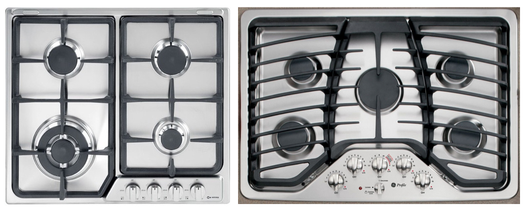
Mappings dictates that relationships between the actions user takes and the results. Create intuitive connections between controls and features, showing users what actions lead to specific outcomes, also called natural mapping. This will help make your system faster to learn and remember.
In the left image, it is not clear which knob controls which burner = poor mapping. In the right image, the arrangement of the knobs mimics the arrangement of the burners = good mapping.
Some of these terms overlap with each other so don’t hesitate to discuss with other designers the best way for you to refer to your designs. By incorporating these terms into your design vocabulary, you’ll enhance your ability to express and advocate for your designs. 🎉