
Daily UI/UX Challenge
In an effort to improve my UI skills I will be using the daily UI challenge to prompt me to continue to design and learn the intricacies of Figma (and whatever other tools crop up).
But I will not forget that I am first and foremost a UX designer, and I must always consider the problem, the user and aligning functionality to business metrics.
Now, away we go!
Day 17: Email Receipt
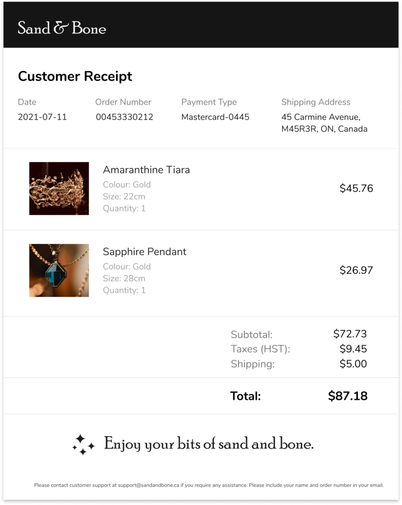
This is an email receipt on desktop.
User: Anyone who is purchasing objects or services online will be receiving email receipts.
Frustration: When it is hard to understand what has been purchased or how to contact customer support, users get frustrated.
Why users will like this: The receipt is simple, with features from receipts the user might have previously seen. The information is clear and simple.
Explanation
Customer Details at the Top: With the details at the top the customer knows exactly when and how they paid for their items. This way they can clearly notice if something is incorrect and then contact the support team quickly.
Images: By including images the user can be clear about what they have purchased.
Branding at the top: Customers are immediately aware where this receipt is from without having to read the receipt in depth.
Next Time...
While I do believe a Sans Serif font is better for the majority of the text here I want to look for a better Sans Serif font, rather than just using Nunito as a backup. It doesn’t fit the theme as well as another font might have.
Day 16: Pop Up Overlay
This is a popup on a mobile screen.
Frustration: Users get frustrated when popups do not quickly explain what they are about and when there is no easy way to exit them.
Why users will like this: This popup is small but friendly and allows the user two ways of exiting it, the x at the top and the submission of an email address.
Explanation
Image: The cute image at the top helps increase delight, since the user might be expecting something intrusive when popping up.
Descriptor under title: A quick and short descriptor as to what the user would be getting if they provide their email, allows the user to be clear as to what gains the popup is providing them without having to research or read up on the benefits.
Email & Submit Button together: Instead of having to travel to another page the user is able to submit their email address to make use of the popup immediately.
Next Time...
I’d like to take some more time to design the image for optimal friendliness and delight.
Day 15: On/Off Switch
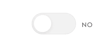
This is a very simple toggle button for a Yes and No state.
Frustration: Not knowing whether the toggle button was in the on or off state.
Why would people like this: There is text that provides visibility into the system status, as to whether or not the toggle is on or off.
Explanation
Colour: The change in colour can help some users identify if the toggle is on or off.
Text: The text simplifies the visibility of system status for all users, helping them understand whether the toggle is on or off, regardless of their capacity for seeing colour.
Next Time...
I’d like to spend more time personalizing the toggle, I know there is no need to complicate it, but even thinking about the colour of the ‘on-state’ or the stroke around the toggle would help add to the branding of a particular company.
Day 14: Timer
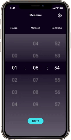
This is a small flow for a simple timer.
User: Someone who needs to set a mobile timer.
Frustration: Not being able to see the difference between start and stop, or having confusing reset or lap buttons available.
Why would people use this: The design is very simple with two colours, blue for not started yet and yellow for counting down. Those colours help the user identify what state are they on.
Explanation
Circular Countdown: The circular countdown helps the user generally visualize how much time they have left in the timer.
Distinct Colours: The two colours, blue and yellow are used to help the user identify if their timer is actually running. Blue for stopped and yellow for running.
Translucent Numbers on the home screen: There is a banner on the main screen where the timer number shows up, but above and below is a translucent screen, allowing the user to see what numbers are ahead and below.
Next Time...
I’d like to spend more time on the translucent time chooser section, there are some creative curvature and design that can make the unchosen numbers still available but obviously not the chosen numbers.
Day 13: Messaging
This is a small flow for a messaging application.
User: Someone who wants to contact their friends and families, but talks about a lot of different topics with each.
Frustration: Having multiple conversations simultaneously with the same person or group chat and having to keep track of all those threads themselves.
Why would people use this: In these screens, a user can set up threads with each group or user they are messaging. These threads drop down from the top in the same order every time and allows the user to keep track of conversations about different things on different screens.
Explanation
Drop-down menu of threads: At the top of the screen, just under the group-chat name is a bar that has the thread name that you are currently on. When you click the bar or the arrow then you can see all the threads that have been created for this particular conversation. The user is able to seamlessly switch between threads and can keep information related to specific threads organized.
Dots at the home page: The app highlights conversations that are unread by bolding the name and text and adding a red dot under the time, to provide the user with a graphical way of understanding which messages to respond to.
Next Time...
I’d like to spend more time thinking about how to create threads. I imagined the user would tap the menu and that is where they could create threads however there is nothing indicating to the user that that is where they need to go.
Day 12: Ecommerce Product Page
This is a product page for a clothing website, Transcend.
User: Someone looking to purchase a dress that fits them.
Frustration: Being unsure about the sizing of particular dresses and wanting to be sure of the quality of something before purchase.
Why would someone use this: There is very specific sizing available on this page, with size type and size, along with the size chart that will pop out of the webpage without leaving it. There are further details and reviews that are easily accessible and detailed.
Explanation
Colours: The colours are simple, black and white for the most part, so the clothing can be showcased more easily.
Sections: I made sure to include other products of interest and reviews on the page, so people will have an easier time deciding whether or not to purchase this item of clothing.
Next Time...
I’d like to pay some more attention to the review section, even though it is an important part of the user journey, I did not necessarily think about each part of it as I was designing, I just thought about what I regularly see in a review instead of breaking it down into the necessary parts.
Day 11: Flash Messages
These are simple screens with flash messages, success and failure, for a payment at a bookstore.
User: Someone interested in purchasing books online.
Frustration: Not being sure if a payment went through after confirming payment details.
Why would people use this: These screens are extremely explicit, giving the user instant, distinct feedback as to whether their payment went through. It acts as a confirmation of their actions.
Explanation
Colours: The colours are coordinated to match the message, green for success and red for failure, however the copy also represents this difference, because design cannot only rely on colour as messaging.
Book icons: I used this as an opportunity to draw my own icons and I think I can safely say I do not have a future in icon design, however it was fun looking at existing icons and learning how I can bend a straight line to create these shapes.
Next Time...
This is the second time I have used 3D baubles as decoration, next time I should consider doing something different to add texture in the background, such as blurred circles or textures.
Day 10: Share Icon
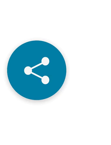
This is a simple share icon within a news application.
User: People who are keen on acquiring new information and sharing it with others.
Frustration: Having to constantly link people, them complaining about not being able to access the article and having to open up another application to share.
Why would someone use this: This share button includes all of the major (current) social media platforms, as well as email and the ability to copy the link. This allows the user flexibility when deciding to share the article.
Explanation
Colours: The colours are simple, I inverted the colours of the share button when it is clicked, to alert the user to the fact that the next step, if they do want to share, would be clicking an icon with a blue background. I made the blue background with white imagery the functional pathway.
Interaction design: It looks interesting, and dare I say delightful, when you see small interactions like popups. I wanted to make this a simple yet nice experience for the user.
Next Time...
Next time I want to consider adding shadows onto the smaller icons for additional depth, it does end up looking fairly flat.
Day 9: Music Player
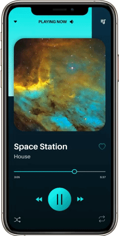
This is a few screens from a futuristic music player. It goes from one song view to the entire playlist view.
User: Someone who wants their music player to reflect the music they are playing.
Frustration: When a player is static and does not respond to the music being played.
Why would someone use this: the player responds to the visuals that are associated with the music, and maybe on a deeper level, would have colour associated based on the music itself.
Explanation
Colours: The changing colours of the player is the main draw of the app, making listening to music a visually stimulating activity as well. There is delight to choosing new songs.
Next Time...
Next time I will better consider the favourites, search and arrow icons. I put them into the system because that is what I see in other music player apps, but I did not specifically consider where they go, what they do and whether they should be somewhere else to add to the experience.
Day 8: 404 Page
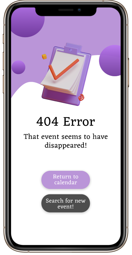
This is a 404, page not found screen for an event planning application. The application allows you to add events, which could be private and only shared with a few people, to public events for everyone.
User: Anyone event planning who wants to use the app to share events and calendars, or a person who is interested in finding new events to fill up their schedule.
Explanation
3D Image: 3D images are popular for their realistic and modern feel, while still retaining an animated quality. I only used one 3D image, to prevent overstimulation, but provide some delight on a fairly simple and static page.
Different coloured buttons: Under the Error notice there are two buttons, one purple, the suggested route and one grey, an alternative route. The buttons are coloured differently to show the user that they have different functionalities.
Next Time...
The purple background behind the image seems a little flat, I would like to try to make it more interesting to look at, through a pattern or blurred shapes to see if that will juxtapose against the 3D shapes well.
Day 7: Settings
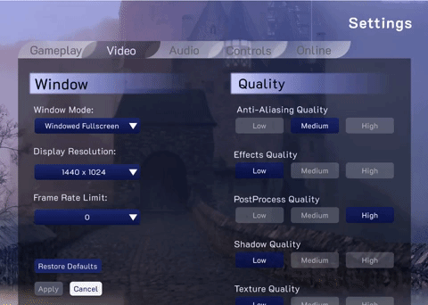
This flow is of the settings screen in a PC fantasy video game.
User: Gamers, who have to deal with a slew of settings and controls in a complicated video game.
Frustration: The inability to quickly see what settings are available.
Why would people use it: The settings screen is similar to other PC video game setting screens, providing consistency, however instead of using arrows to run through options, I included a dropdown menu, to quickly see all options.
Explanation
Dropdown menu: By including a dropdown menu instead of scrolling arrows, the user can see all their options immediately and at the same time. It reduces the necessity for recall.
Glassmorphism: I have light glassmorphism happening (inspired by Dragon Age Origins settings screen), to keep the user immersed in the world.
Next Time...
I want to consider what copy I can change to immerse the user into the world of the game even while they are in the settings screen, where the settings are connected to the gameplay.
Day 6: Profile
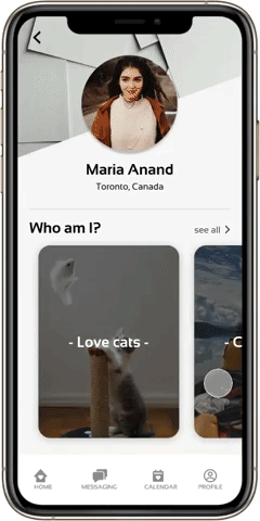
This flow starts with the profile of a girl, Maria Anand, on a dating app.
User: Teenagers or young adults who want to date or start a relationship based on mutual interests and real connection.
Frustration: Many of the current dating apps succumb to one of two problems; 1) being too focused on looks and having little information about the person available on their profile, 2) Having too much textual information to parse through to understand the person in the profile.
Why would people use it: This app balances the importance of visuals with context as it allows the user to swipe through a profile’s interests, gather further information as well as pictures on an interest and then message the owner of the profile.
Explanation
Horizontally scrolling interests: A user can see a “who they are looking at” through the Who Am I carousal. They can get a quick snapshot of the person and see whether or not they want to explore further.
Message button: The message button can be found on the explanation page for each interest/trait, making it easy for the user to decide to message the profile owner at any time.
Message suggestions: Based on which interest/trait they were on when they chose to message the profile owner, suggestions for starting conversation will pop up, to help the user break the ice and start the conversation.
Next Time...
I should consider including a message button directly from the profile page, in case the user immediately wants to message – however, by hiding the message button, it allows for people who are actually interested in this profile’s hobbies to reach out to them.
Day 5: Logo

This is a logo for a natural, organic and vegetarian based café.
I wanted a customer to feel like they were stepping into a patch of earth when they step into the store and the vibes of the logo reflected that.
I used monochrome brown when designing the logo and used a Sans Serif font to display a comfortable and homey feel.
Day 4: Calculator
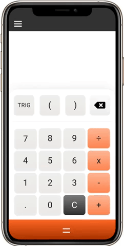
This calculator flow includes opening up the trig menu and clicking calculate.
User: Student in Grade 10 who is starting to learn more complex mathematics, like trigonometry, but doesn’t need more complicated functions.
Frustration: Having to press a ‘second function’ button on the physical calculator before being able to use trig commands, making it more complicated to use.
Why would people use it: This calculator emulates the simplicity of a calculator a student would have used when they are younger. It slowly introduces the concepts of more complicated mathematical structure using a simple button that allows them to open up a button tray with the options they need.
Explanation
Long “equals” bar: By making the equal bar longer and at the bottom of the screen, it does not blend in with the functional buttons on the rest of the calculator.
Grey “clear” button: Retaining the shape adds consistency, but I changed the colour of the clear button to differentiate the functionality from every other button on the calculator.
Animation: I added an animation after clicking the TRIG button, to show that these buttons are in the same family and they are associated with the larger, now orange TRIG button. It also adds some delight to using the calculator.
Next Time...
After being pressed the TRIG button should not be the same colour as the Equals button, because their functionality is different. I should make the colour of the TRIG button the lighter orange after being pressed.
I would like to add more functionality, such as and Exponents button or Polynomial button, which also expands, similar to the TRIG button, to provide the user with the options they need.
Day 3: Landing Page
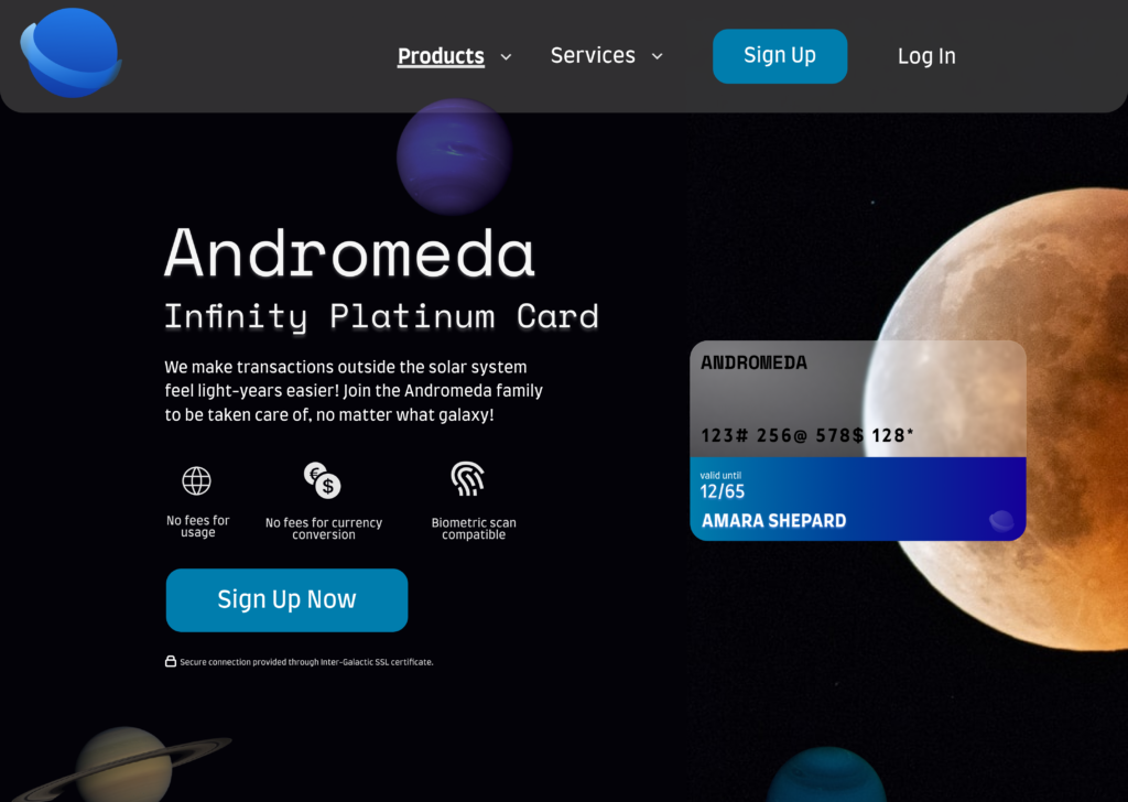
This landing page was my first time practicing glassmorphism, which is taking the design world by storm. I decided to put a spin on regular credit cards, imagining this landing page for the Andromeda Infinity Platinum Card, a card for those inter-galaxy travelers.
User: Professionals who are commonly travelling into the further reaches of the galaxy where their regular credit cards won’t work.
Frustration: Not knowing the specifics of a credit card without a lot of research into the product.
Why would people like it: The card name is front and center, but more importantly are the key perks to having this card, it allows the user to quickly understand whether or not this card will meet their needs without scrolling further and researching more.
Explanation
Glassmorphism: This style of design is sharp and projects a feeling of modernity. I wanted the user to feel like this is a card that would serve all their needs in a world even more “modern” than ours currently is.
Friendly and caring copy: Travelling to the edges of the galaxy can be scary, so I wanted to make sure the user felt taken care of as they read the copy, and feel a sense of family and ease.
Perks under explanation: This allows the user to quickly take a look at what this card can do for them.
Different coloured CTA: The colour draws the users attention and reminds them of what they can do to, easily, get this product.
Next Time...
I want to pay more attention to the global navigation bar, it seems fairly plain in this exercise. I should also probably reconsider the size of the font on the global navigation bar, it looks too big.
Day 2: Credit Card Checkout
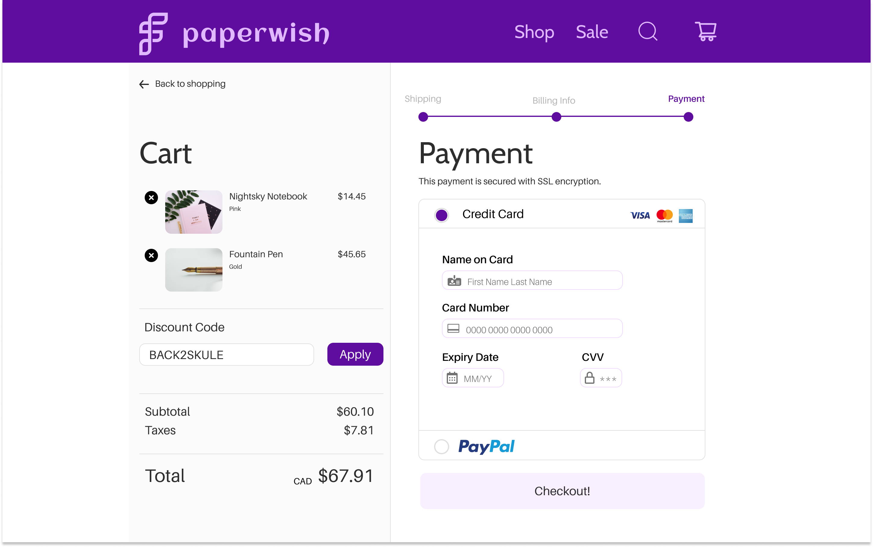
This credit card checkout includes the last page, the payment page, of the credit card checkout flow.
User: Students, young professionals who want nice stationary.
Frustration: Not being able to remember what is in their cart as they go through the long checkout process, especially on a new website.
Why would people use it: The dual column system is simple and allows the user to view what they are purchasing as they are going through the checkout process. They are also able to easily make edits or add discount codes at any time during the process.
Explanation
Progress Bar: This bar on the right helps the user understand at what point in the payment process they are, how many sections there are to fill out and gives them easy access to move backwards in the process if need be.
Inactive Button State: Light purple was chosen as the inactive state (checkout button) for all buttons, reminding users that they cannot move forward until they fill out all the necessary information, at which point the button will turn dark purple (discount button).
Grid: On a 1440 x 900 px grid, I created a safe-zone of 1024 px horizontally to develop the design. This is to account for standard computer screens.
Next Time...
I’ll try to pay more attention to the website branding instead of just using monochrome colours. I didn’t develop the brand very much – I focused more on the checkout section. But brand is important to retain at all steps of the process.
Day 1: Sign up
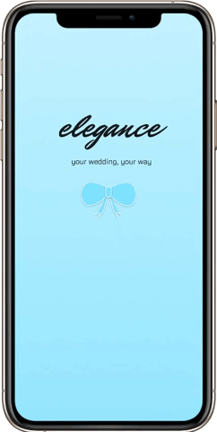
This sign up flow includes a splash page and a login screen.
User: Women interested in high-end wedding planning services.
Frustration: Handling multiple vendors and organizing dates, times and requirements for them all separately.
Why would people use it: It starts off simple, suggesting to the user that the experience using the application will also be simple but interesting to use at the same time.
Explanation
Typography: Title font is decorative to make the user feel like they are using a high end product.
Colour: Blue is a calming tone that might help brides and grooms feel more relaxed as they go through a stressful planning period.
Feedback: Confetti is used as feedback to the user to let them know the application is loading.
Animation: To add some surprise and delight to the log-in process.
Next Time...
The final log-in screen is a little plain and doesn’t necessarily emulate “high-end” – I’d use inspiration from high-end restaurants or hotels next time.
The animation of the bow dropping down into the log-in screen can be perceived as tacky – I’d cut back on the multiple animations at once.