
Usability Evaluation
Using the Neilson Group’s UI Usability Heuristics, my team testing the usability of the Subway® Android mobile application.
We identified 10 main heuristic violations and designed recommendations to improve them. In preparation of a developer handoff, we created a UI Library with the components necessary for the redesign.
Usability Evaluation
DATE
April 4th, 2021 – April 23th, 2021
TEAM MEMBERS
Hema Nookala, Ethan Van Sant, Yousaf Khan
TASKS
Heuristic Evaluation, Application Redesign, UI Library
APPLICATION
Subway Mobile on Android (Canada & USA)
MY ROLE
Heuristic Evaluation, Checkout Screen + Partial Customization Redesign, UI Library Organization & Components
Subway on Mobile
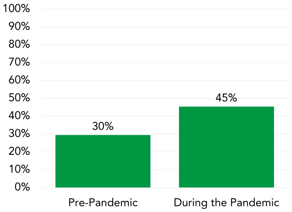
Subway launched its mobile application with remote ordering capabilities in 2015 [1].
Today the application provides heightened consumer convenience, to help them save time, to customize and develop loyalty.
Heuristic Evaluation
REASON
To make sure Subway remains competitive on the Android market.
EXPLANATION
A heuristic evaluation is a systematic method of determining a products usability. It uses 10 general principles or heuristics as rules of thumb and compares the current application with the ideal scenario.
Heuristic Checklist
We chose 5/10 available heuristics to focus on after scanning through the application.
-
Consistency & Standards
Users should not wonder what words or situations mean.
-
User Control & Freedom
Users should be able to quickly correct mistakes.
-
Recognition over Recall
Minimize the user’s need to remember information.
-
Error Prevention
Eliminate error-prone conditions or present the user with confirmation.
-
Aesthetic & Minimalist Design
Interfaces should not contain irrelevant information.
Heuristic Severity
Not a Problem
This is not a heuristic problem.
Cosmetic Only
Need not be fixed unless extra time is available on project.
Minor Usability Problem
Fixing this should be given low priority.
Major Usability Problem
Important to fix, should be given high priority.
Usability Catastrophe
Imperative to fix this product before it can be released.
User Flow
Placing an Order on Android
Lastly, we decided to focus on the User flow of Placing an Order. We looked through screens all the way from home-page to checkout.

Homepage
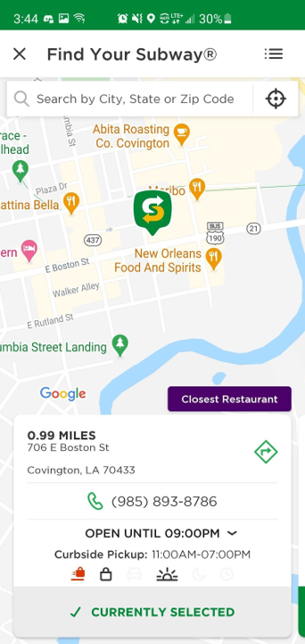
Location
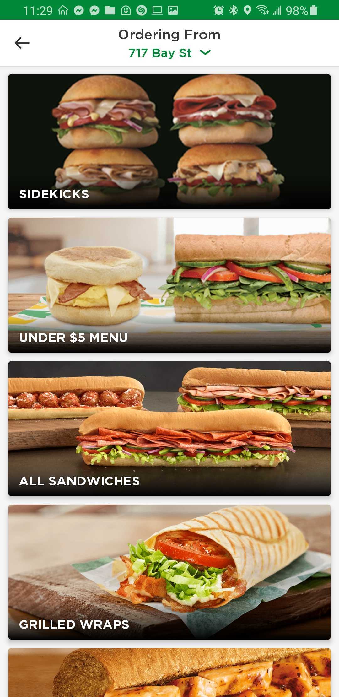
Start Order
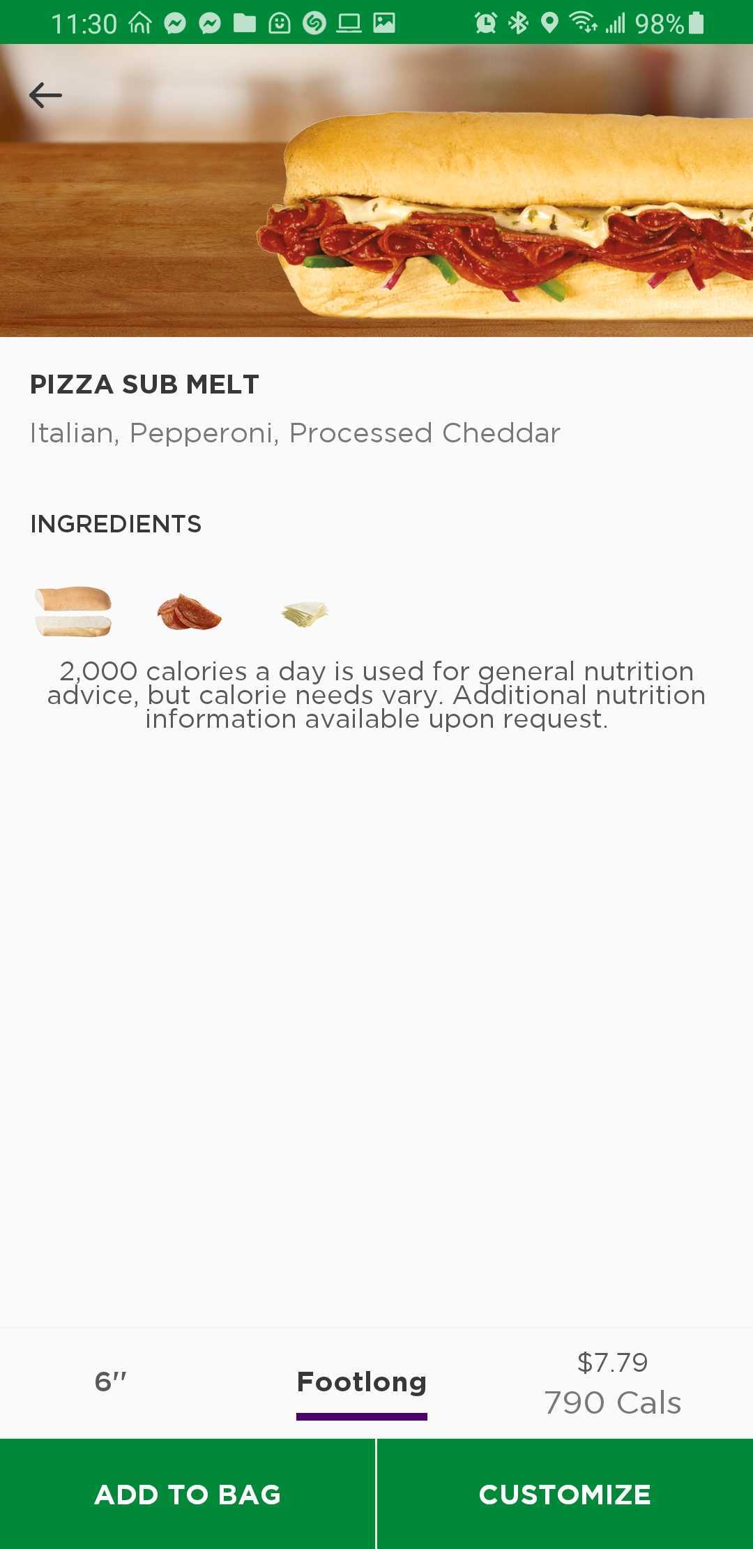
Sandwich Page
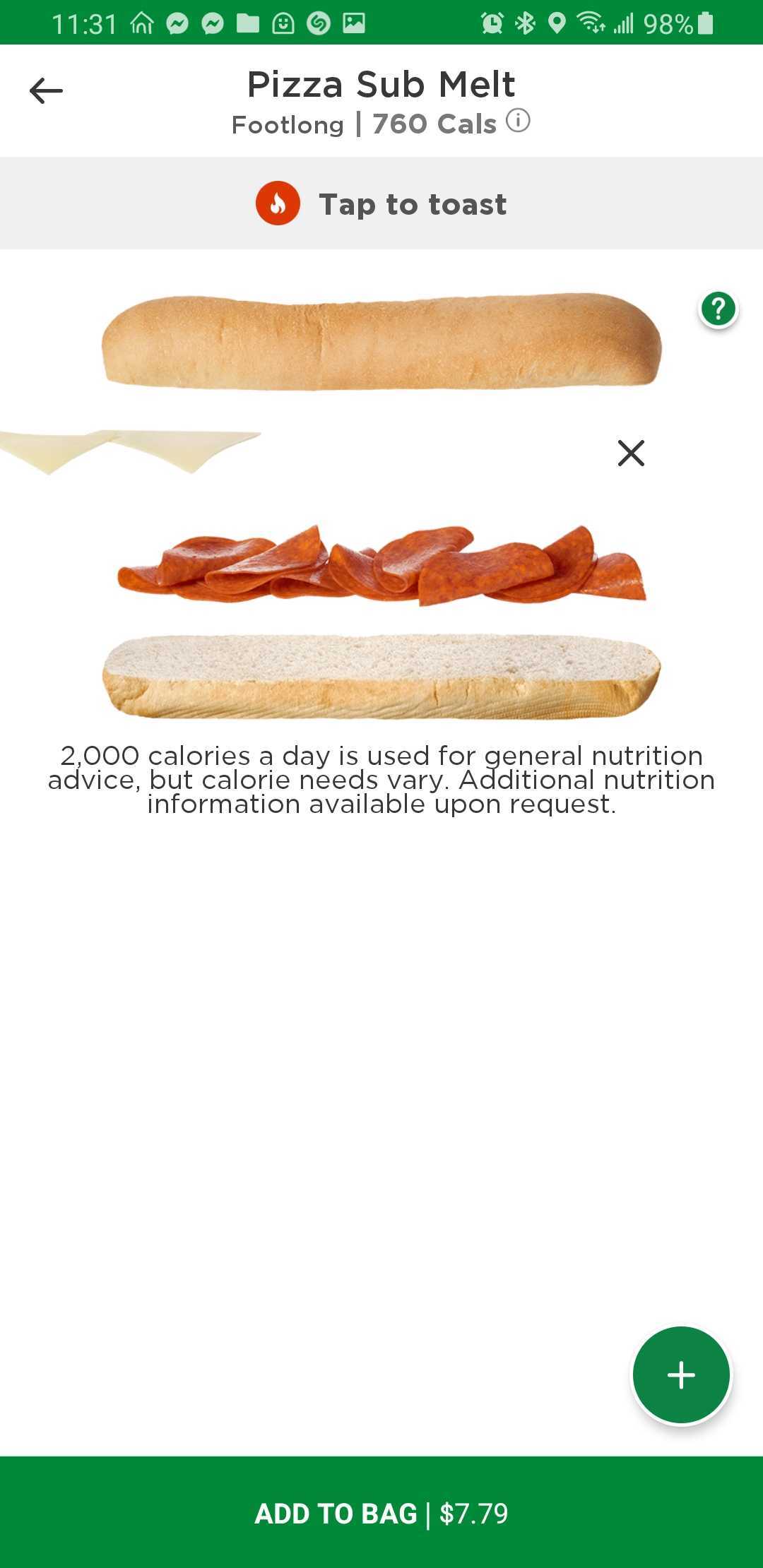
Customization
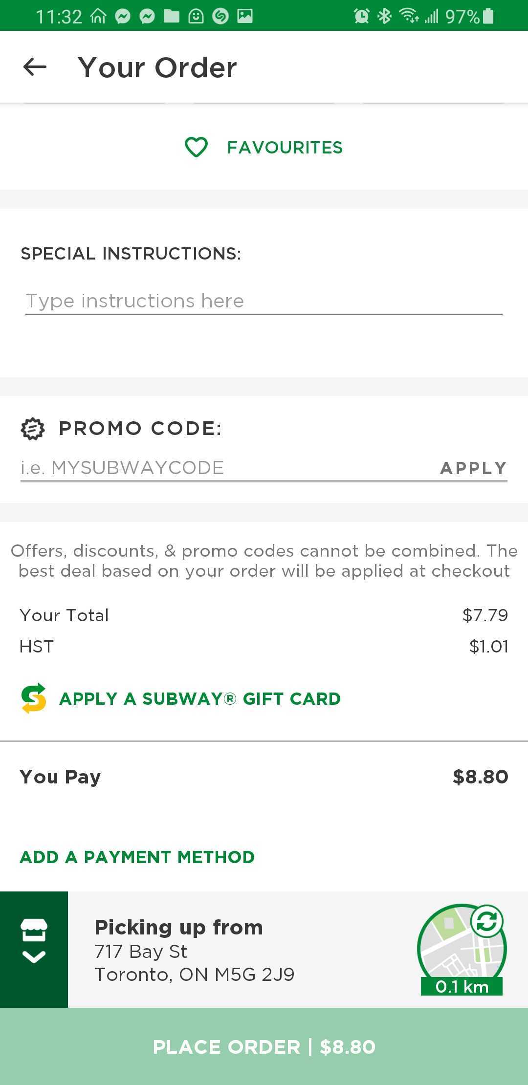
Checkout
Evaluation Findings & Suggestions
My team tested the flow while considering the above 5 heuristics. We identified 14 usability violations and decided to put our focus on 10 violations to redesign based on an Effort to Change and User Value matrix.
Violation
CONSISTENCY & STANDARDS
Major Usability Problem
Problem
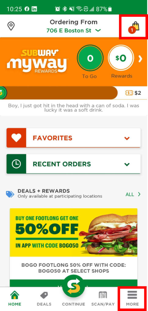
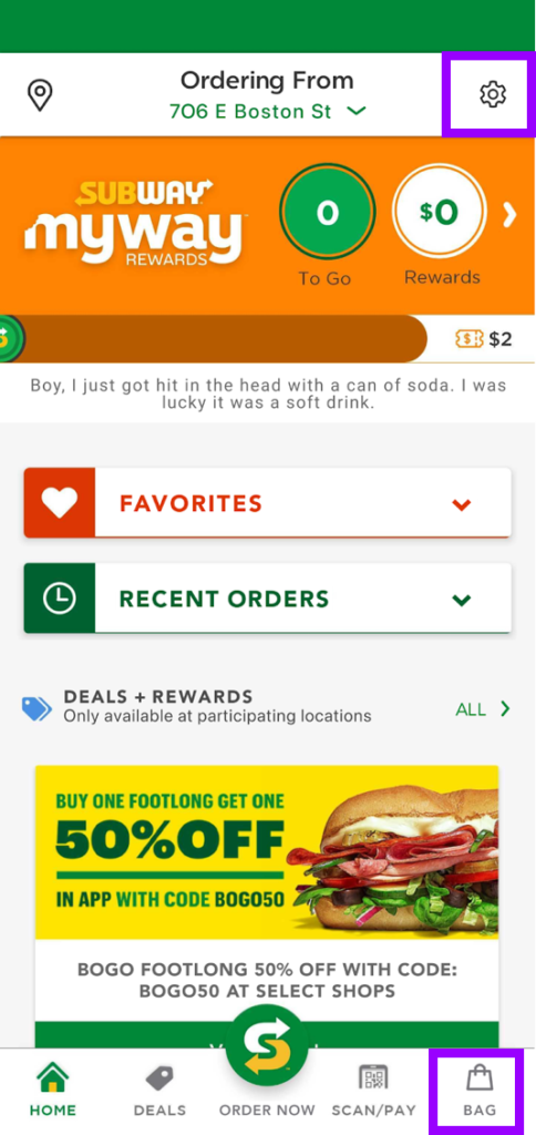
The hamburger menu is normally found at the top left, rather than on the global navigation bar. The heading of More is also unclear.
Solution
The hamburger menu is normally found at the top left, rather than on the global navigation bar. The heading of More is also unclear.
BEFORE
AFTER
Violation
RECOGNITION OVER RECALL
Major Usability Problem
Problem
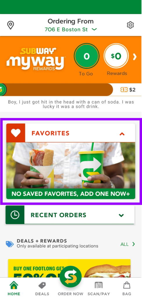
The user is required to purchase a sandwich before adding it to their favourites, restricting their ability of saving order before purchase.
Solution
Allow sandwiches to be favourited from the build or checkout screen.
BEFORE

AFTER
Violation
RECOGNITION OVER RECALL
Minor Usability Problem
Problem
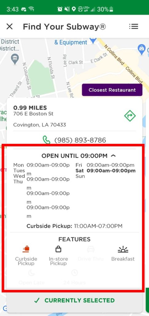
The formatting for the hours of operation is inconsistent with responsive design. Additionally, the meaning of the icons are unclear without the text.
Solution
Reformat hours of operation and rearrange and update the Features icons to be larger and clearer.
BEFORE
AFTER

Violation
AESTHETIC & MINIMALIST DESIGN
Minor Usability Problem
Problem
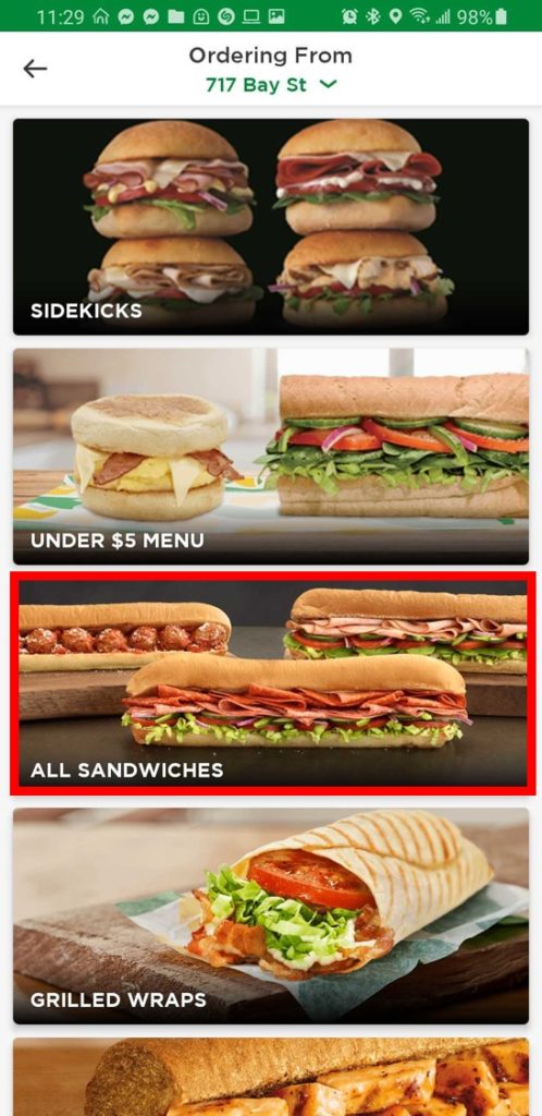
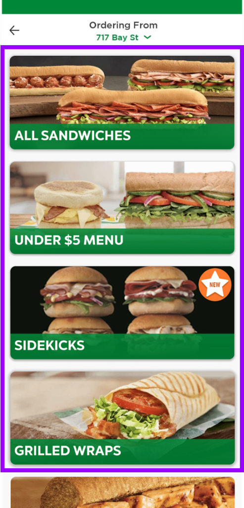
Information architecture unclear for sandwich options.
Solution
Improve information architecture by placing All Sandwiches at the top and clarifying the different options through use of larger titles and colour.
BEFORE
AFTER
Violation
ERROR PREVENTION
Minor Usability Problem
Problem
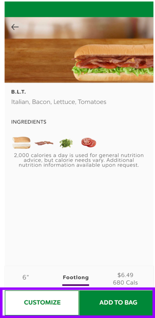
The two buttons at the bottom both serve different functions but are visually exactly the same.
Solution
Moved Add to Bag to the right. Additionally, changed the colour of Customize (as the lower-ranked CTA) to have a white background and green text, still aligning with WCAG AA.
BEFORE

AFTER
Violation
USER CONTROL & FREEDOM
Minor Usability Problem
Problem
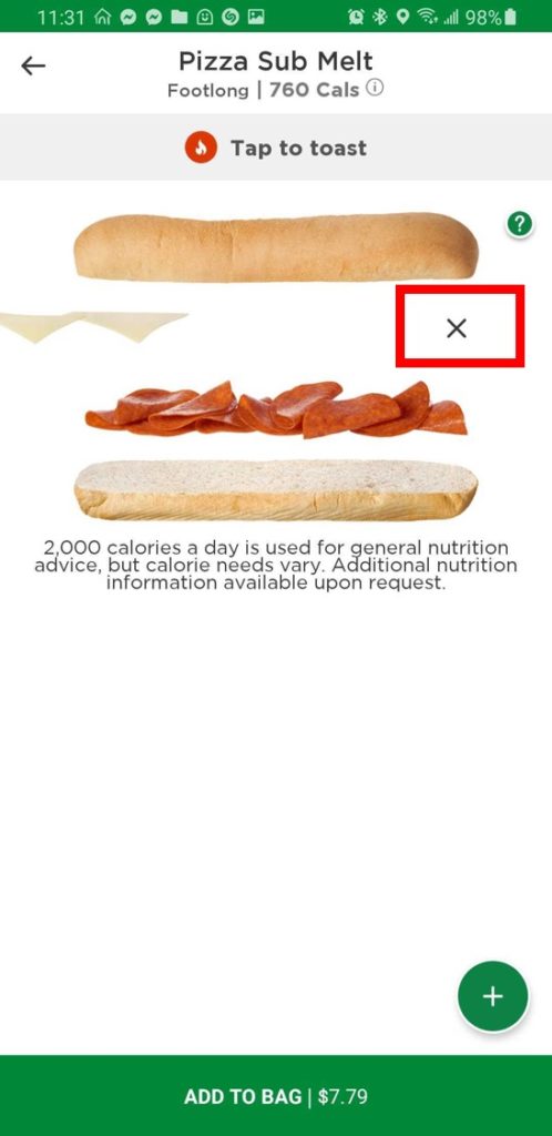
There is no undo button once you remove an ingredient. The only way to get the ingredient back is to go through the + symbol.
Solution
Add an undo button as soon as you remove an ingredient on the main screen.
Additionally, we added quick toppings to allow for further recognition over recall.
BEFORE
AFTER

Violation
CONSISTENCY & STANDARDS
Major Usability Problem
Problem
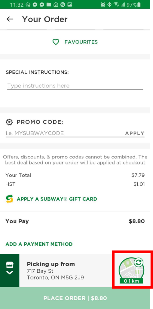
Map with icon is meant to give user the ability to restart order from the location screen. This is not clear to the user.
Solution
Remove unclear icon. Add a full length smaller button with text and relevant icon.
BEFORE
AFTER
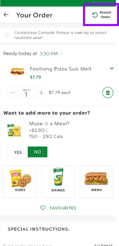
Violation
AESTHETIC & MINIMALIST DESIGN
Cosmetic Only
Problem
“Make it a meal” crowds that actual purchase and is incorrectly above the “Want to add more to your order” question.
Solution
Shift “Make it a Meal” under the title “Want to add more to your order?”
BEFORE

AFTER

Violation
CONSISTENCY & STANDARDS
Cosmetic Only
Problem
Though special instructions and promo code are both similar text inputs, their cards and font sizes differ.
Solution
For consistency, make the font size, font emphasis and card size the same.
BEFORE
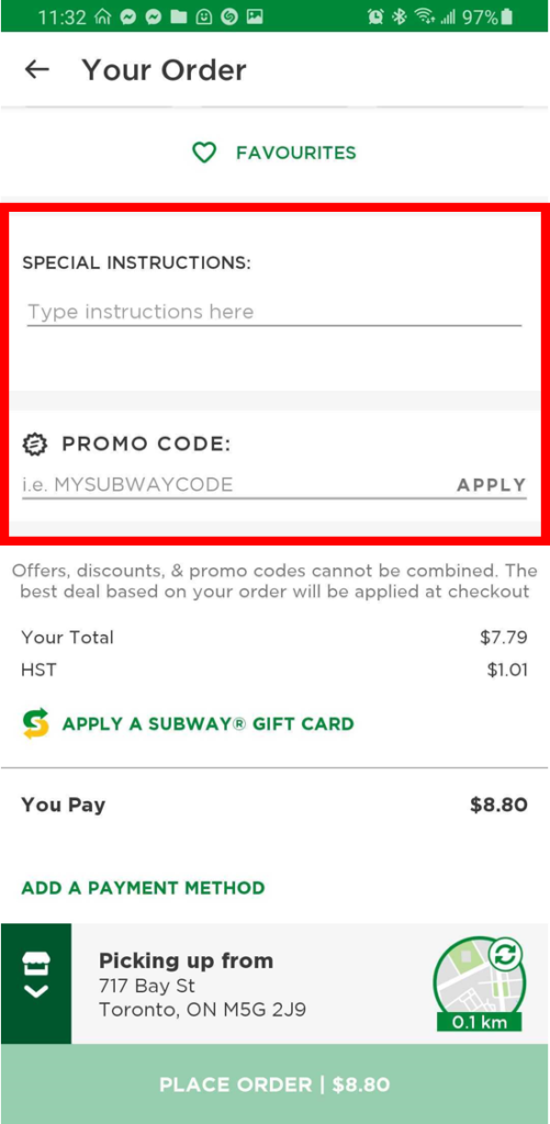
AFTER

Violation
CONSISTENCY & STANDARDS
Major Usability Problem
Problem
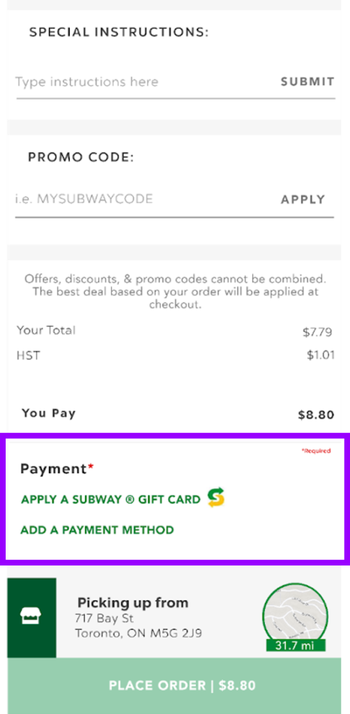
Payment methods are split across divider.
There is no notification that a payment method is needed to move forward.
Solution
Move both payment solutions together and
BEFORE
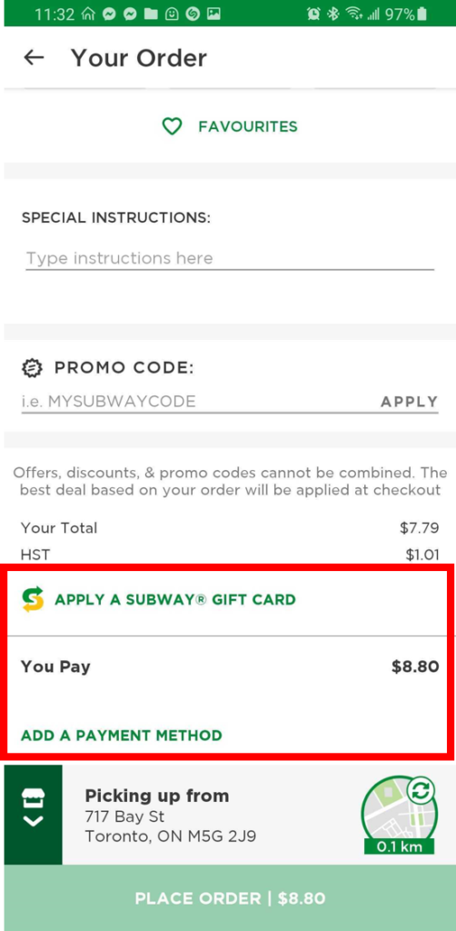
AFTER
UI Library
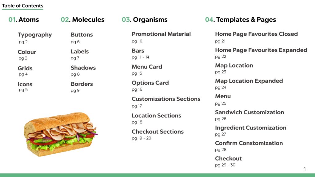
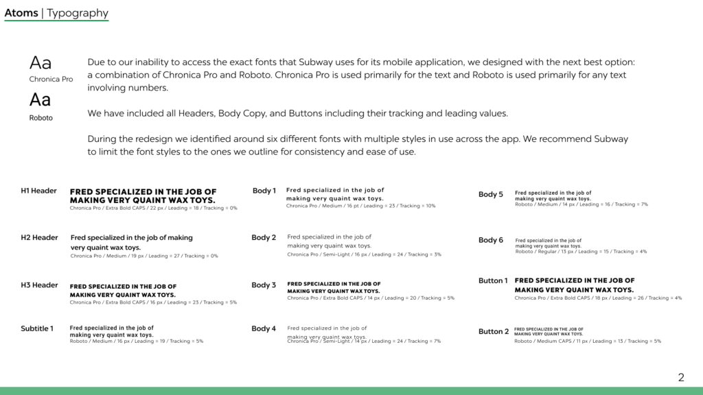
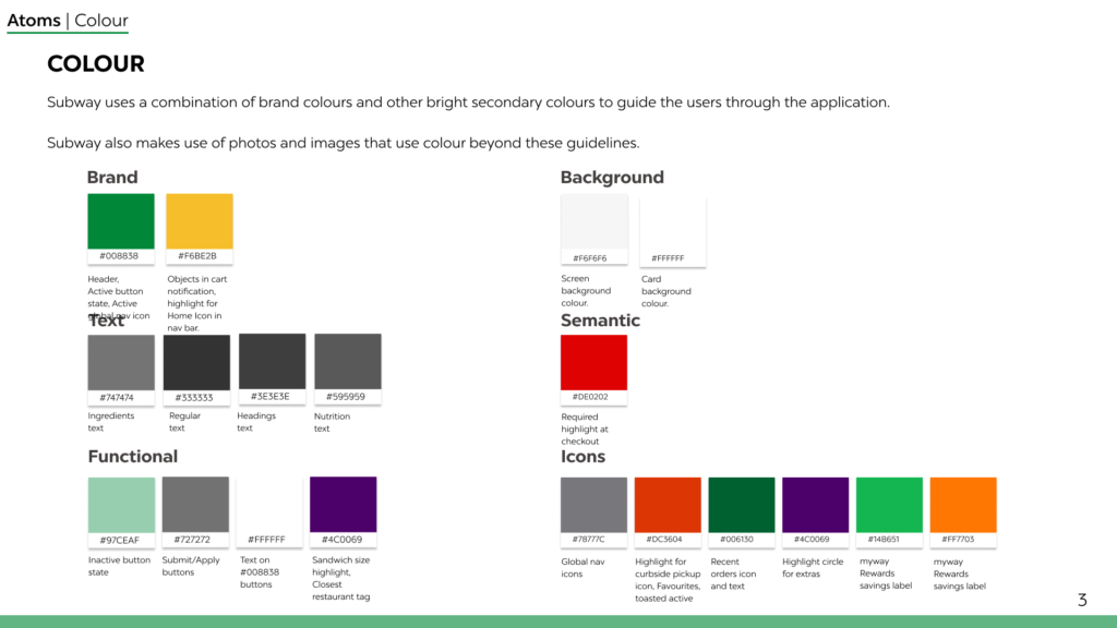
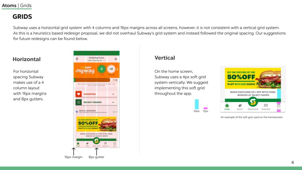
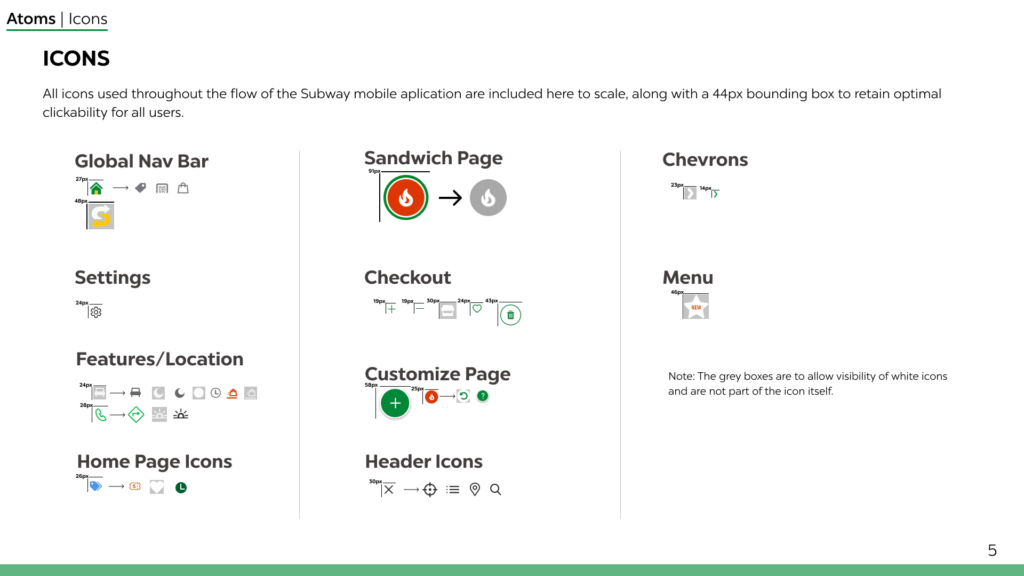
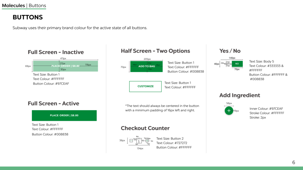
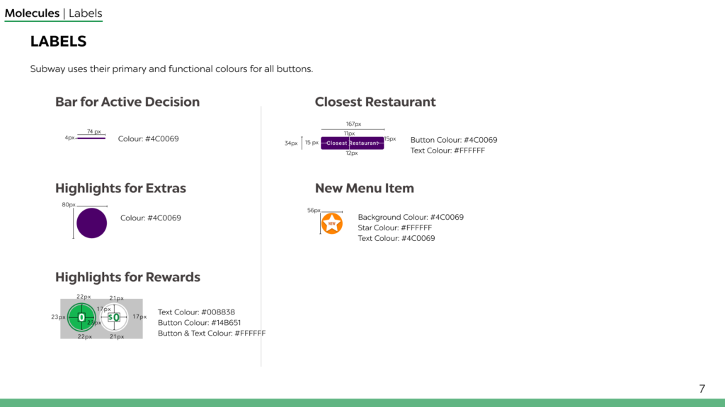
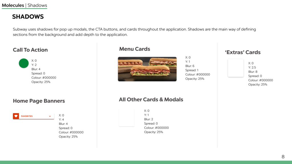
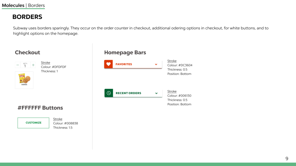
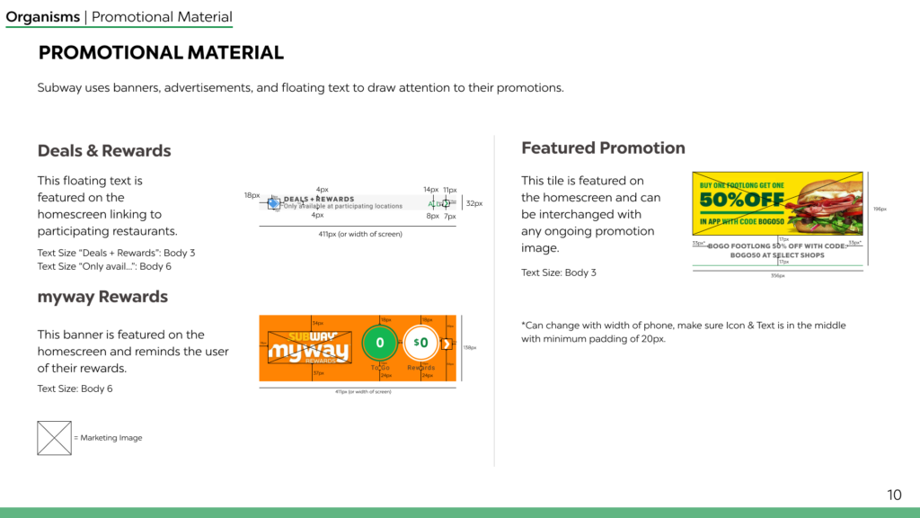
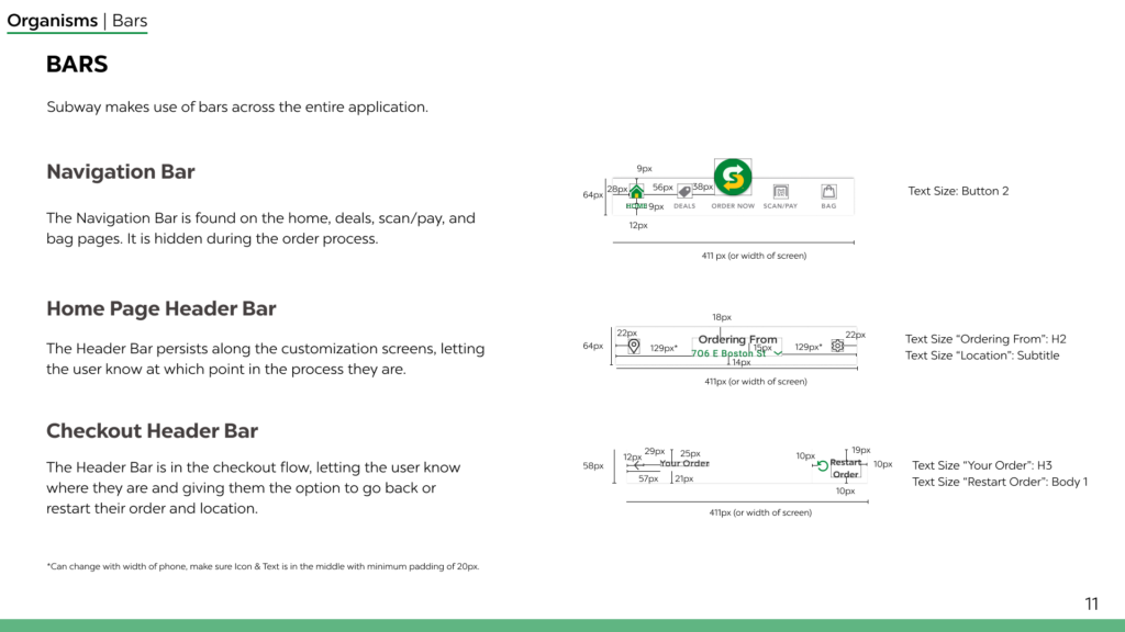
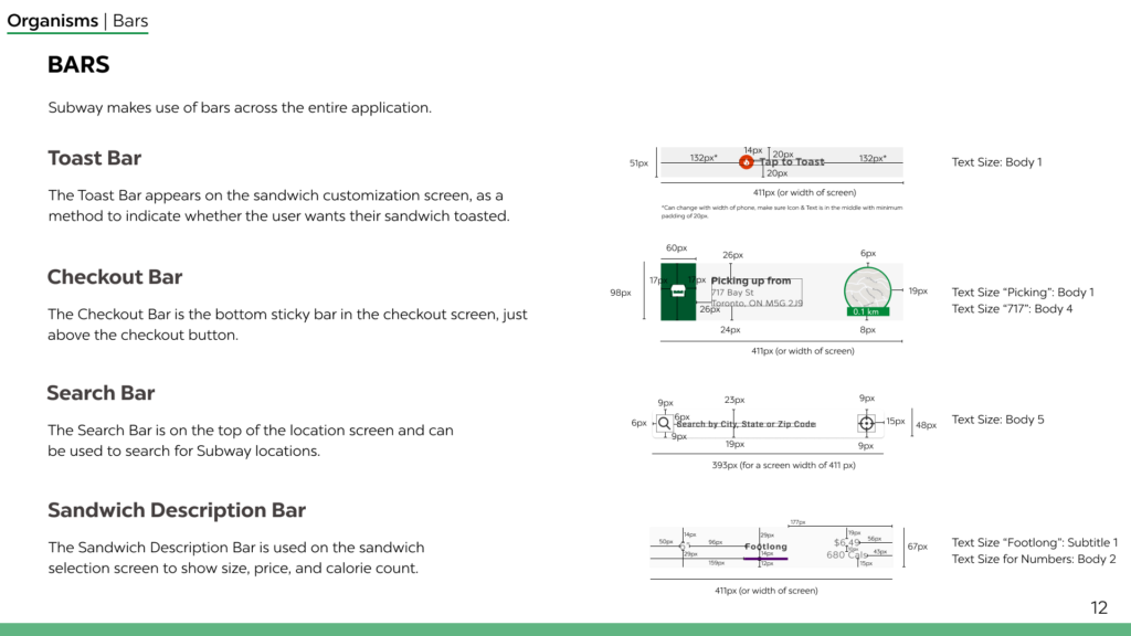
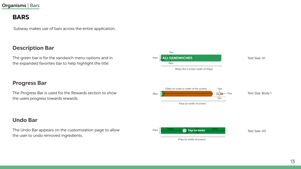
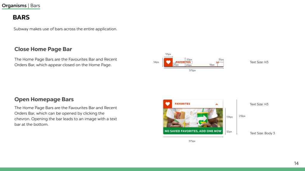
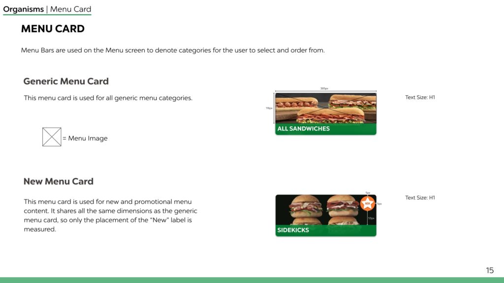
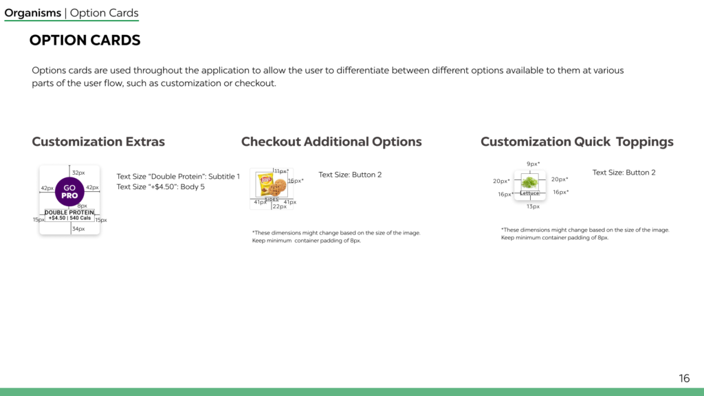
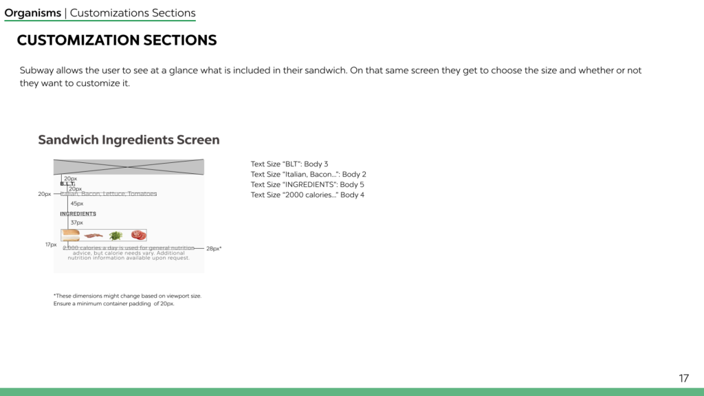
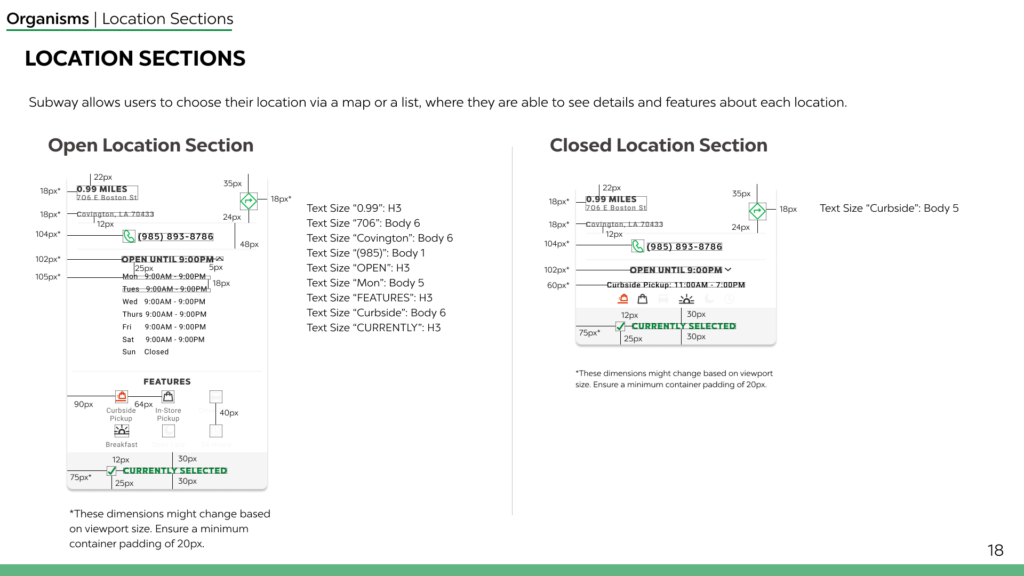
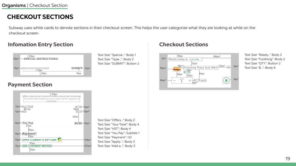
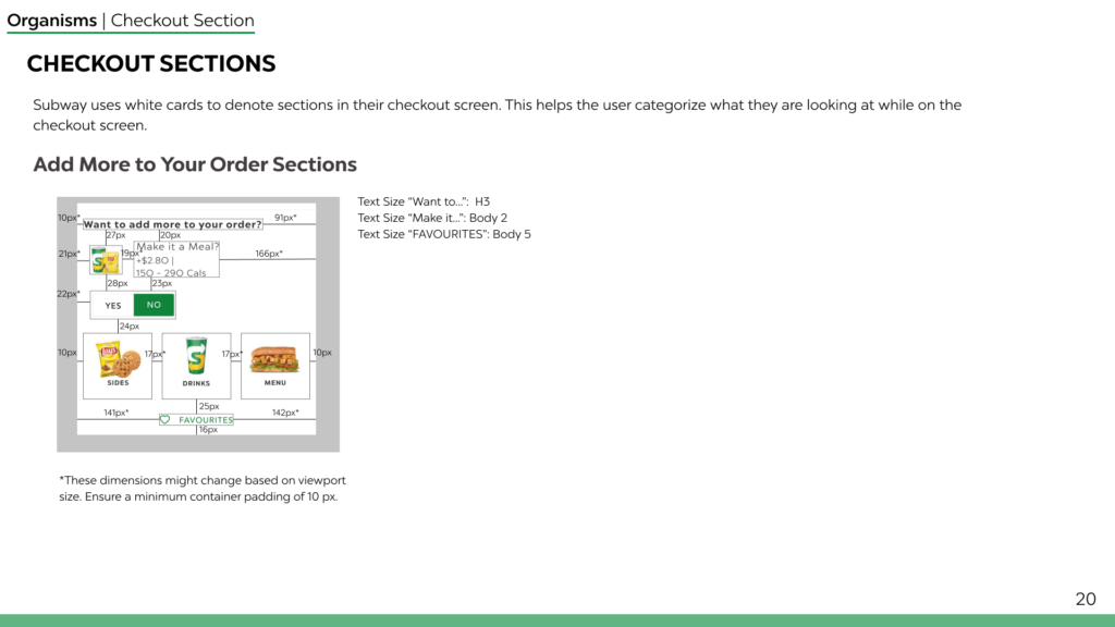
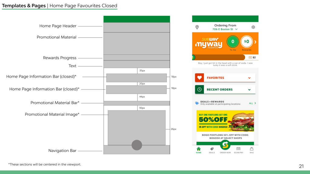
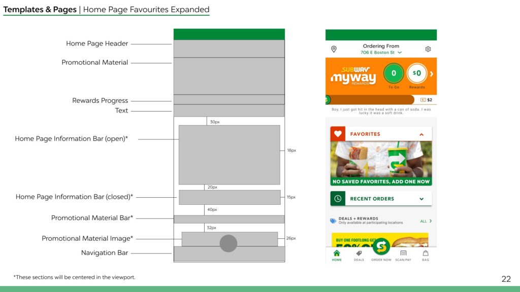
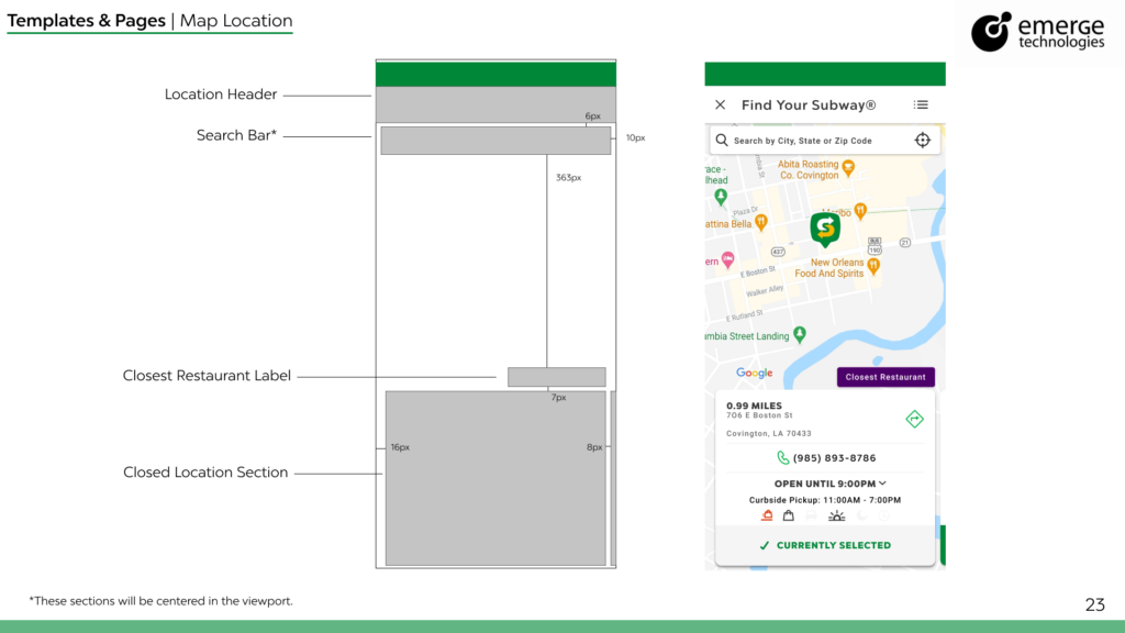
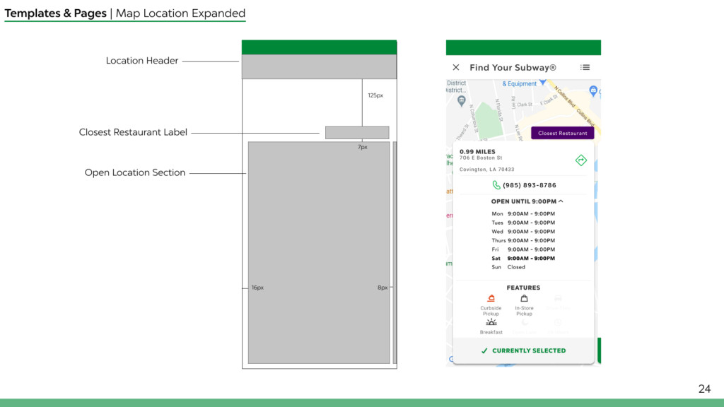
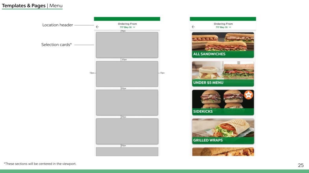
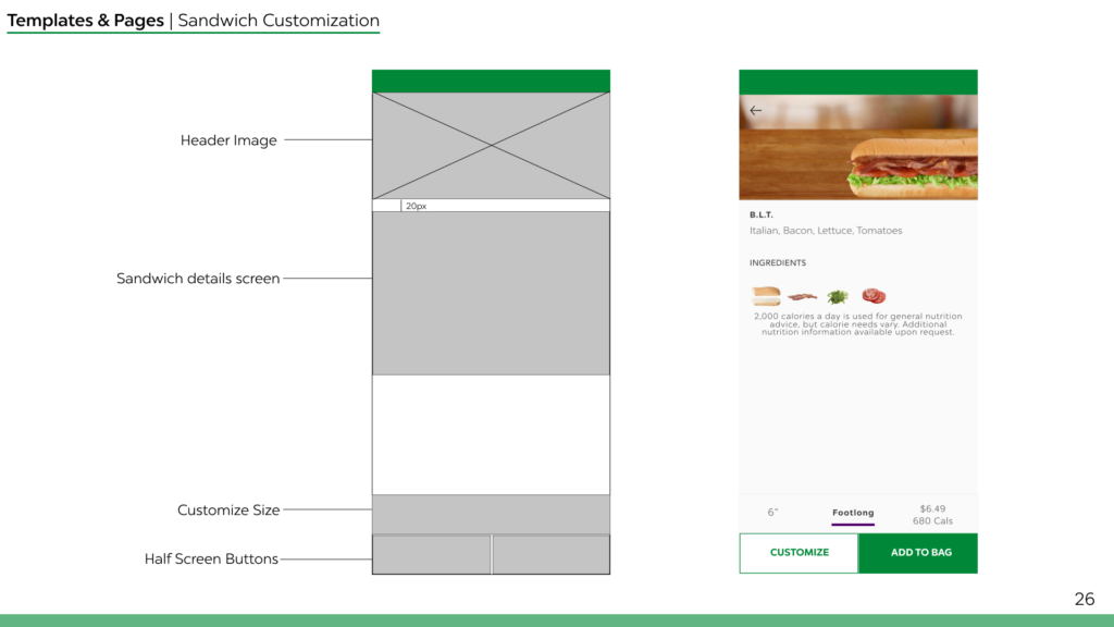
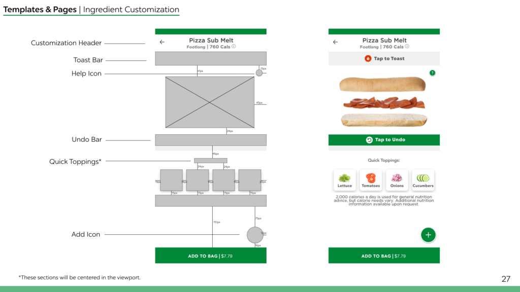
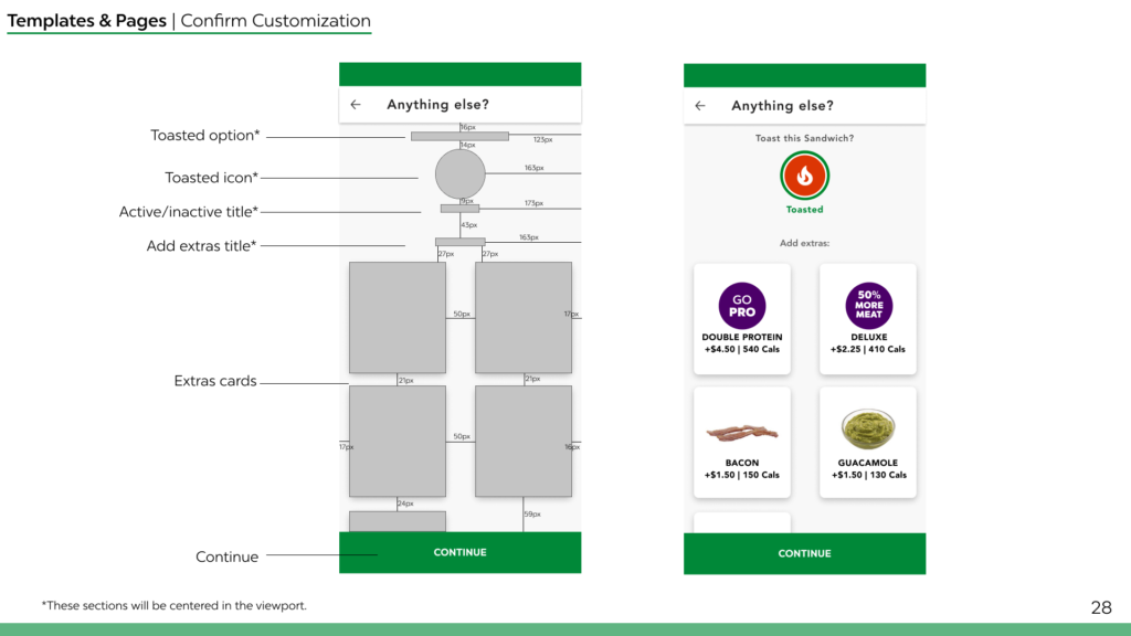
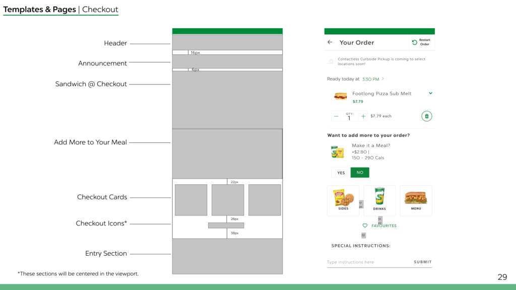
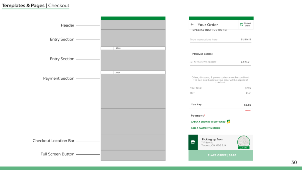
To build the AFTER screens we had to examine the initial application. We replicated the font sizing and emphasis, button sizing and placement and text positioning as well as made changes to repair the heuristic violations. To maintain consistency and make it easier for a developer handoff, we created a UI Library with all the necessary components.
Key Takeaways


Organize Early & Often
Three people working on one document got crazy fast, in the future we'd take time to talk through how to keep things consistent early.

Keep Communicating
With short turnaround times, communicating early and often about expectations and deadlines helped us stay ahead of the curve.

Setting Expectations
Having frank conversations about our workload and the type of project we want to create would help reduce friction down the line.