
Pathways
Pathways is an application that helps high school students navigate the difficult decision of post-secondary. It helps users identify careers that will suit them as well as helps them build the pathways that will make them successful, from institution to the program to the requirements.
")
Project Overview
The Challenge
My journey started when I watched my sister and my parents have an argument about what she was going to do for post-secondary. My sister was so confused as to what she should pursue, it was affecting her everyday life. That experience was the catalyst for Pathways, the application that helps guide high school students in making decisions about what is right for them for post-secondary.
Project Scope
Conduct human-centered design methodology to create a hi-fidelity prototype of an application.
The user demographic is constrained by who I am able to get in contact with. The complexity of the flow is constrained by the time available.
Timeline: 10 weeks, March 2021 – May 2021
Role: Lead UX/UI Designer
Tools: Figma
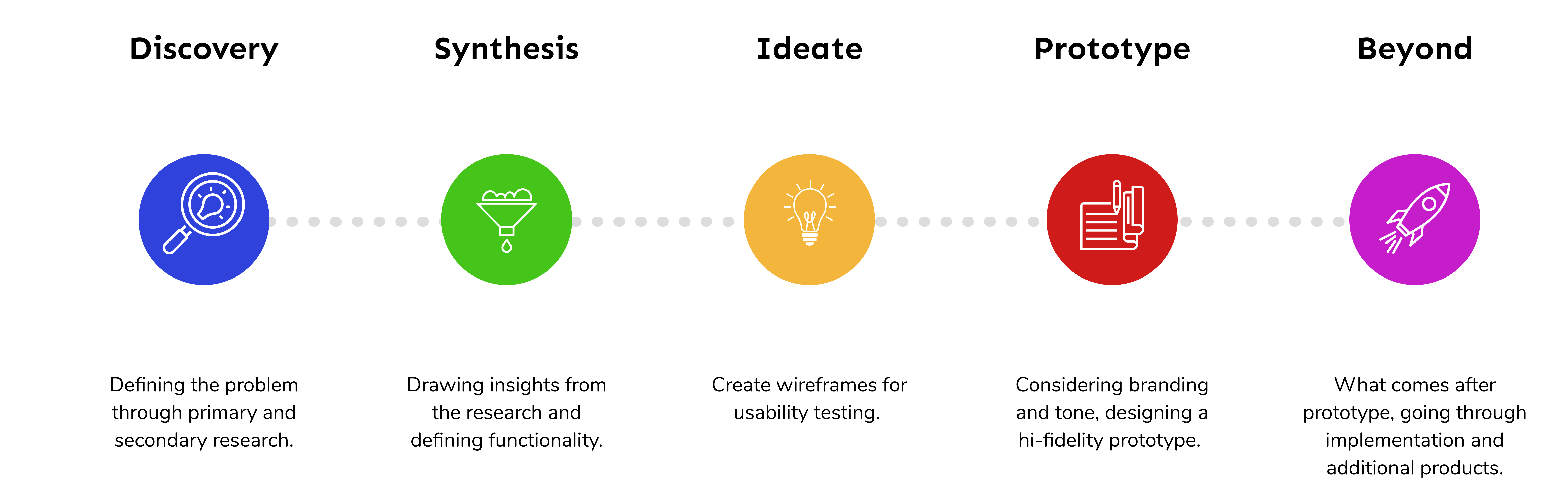
Methodology
How did I go from one step to the next?
The Problem space
Students have to make choices about life with little support.
What is my hunch?
Today, with an overabundance of options and an excessive need to be successful, students in high school are unprepared to make a decision as to what to pursue for post-secondary. They gain support primarily from their families, who are not always equipped to help them handle the choice or the path their choices will lead to.
This leads to higher levels of anxiety within high school students and a dissatisfied workforce.
What am I looking for?
Now, I needed to validate (or reject!) my assumptions and get insight on:
- how high school students feel about making decisions about post-secondary
- what parts they needed more help in or felt confused about
- additional opportunities for improvement
How did I find it?
Secondary Research
I took a look at government stats and articles to find existing qualitative or quantitative data about high school students.
Survey
I sent out a short survey to my user base to obtain some quantitative data.
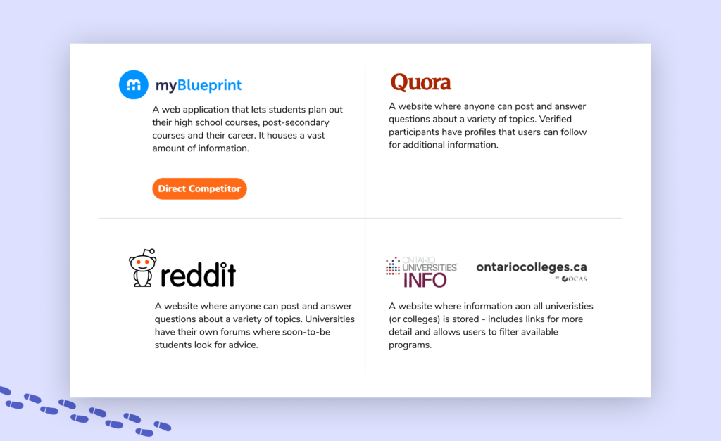
Competitive Analysis
I compared the offering of established competitors.
Interviews
I conducted 1-on-1 interviews to gain qualitative insights from my user base.
Secondary Research Insights
41%
of Grade 12 students experience anxiety and distress [1]
38%
of students aren’t clear about what they want to do they follow the path of those around them – often leading to a dissatisfying job. [2]
93.1%
of people surveyed had different career goals at 25 than they did at 17 [3]
Competitive analysis
I conducted competitive analyses on four companies using the Strengths, Weaknesses, Opportunities and Threats (SWOT) method.
I identified myBlueprint as my main competition as it is currently being used by school-boards across Ontario, however student’s perception of it is not fantastic, believing it to be clunky and house too much information, which gives me an in.
SURVEY
6 / 10
was the response of how confident students were when making a choice about post-secondary.
42%
Of students do not believe school helps them make their decisions.
Interview
Understanding the current support system for students
Who did I interview?
I reached out to a wide audience to ask questions about specific experiences students had during their educational journey. I wanted to explore the shift in perspective from before high school to after high school.
3
Grade 11 students
4
Grade 12 students
2
First year university students
I had some demographic concerns...
I need to note that majority of the students that I interviewed were of Asian descent and they were all only interested in going to a university for post-secondary. Due to these demographic similarities, the entirety of the student population is not represented within the gathered insights. If I were to do this again, I would pay attention earlier on as to the demographic of the interviewees and look into other avenues to find those from a more diverse demographic.
key research insights
Understanding the current support system for students
Synthesis of data
The research helped show me insights that I hadn’t even thought about. I worked to consolidate all these research findings into four key themes.
Communication
Students want to hear opinions about programs and careers from real people. However they struggle with reaching out to a variety of people and therefore cannot get a full and unfiltered perspective.
Guidance
Students want guidance and a constant push during the process of deciding on post-secondary. They want insight into their own thoughts and someone more experienced to help lead them to answers.
Organization
Students use ad hoc organization systems as they need to. This often leads to misplaced or lost information.
Information
Students want detailed information to be easily available and not have to require different websites to obtain a full picture of an institution or program.
Key Takeaways
My hypothesis was proved correct that students were concerned about making decisions about post-secondary. However, I had expected the main cause for this concern to be lack of opinions or information in the fields they are looking into.
I did not expect for 100% of the interviewees to mention that they were overwhelmed at some point in the process. The real barrier for many, it seems is that they are unable to confidently start the search and therefore are blocked when trying to go further.
Students cannot rely on guidance counselors and so they feel alone trying to navigate these difficult decisions on their own – this leads them to put it off or choose an easier path.
User Persona
Finding an empathetic face
I put a face to the insights that I uncovered through the research process as Mai Chen-Khatri. Using this Persona, I will be able to measure whether or not my design will actually solve the problem I am designing for starting from now all the way to the end!
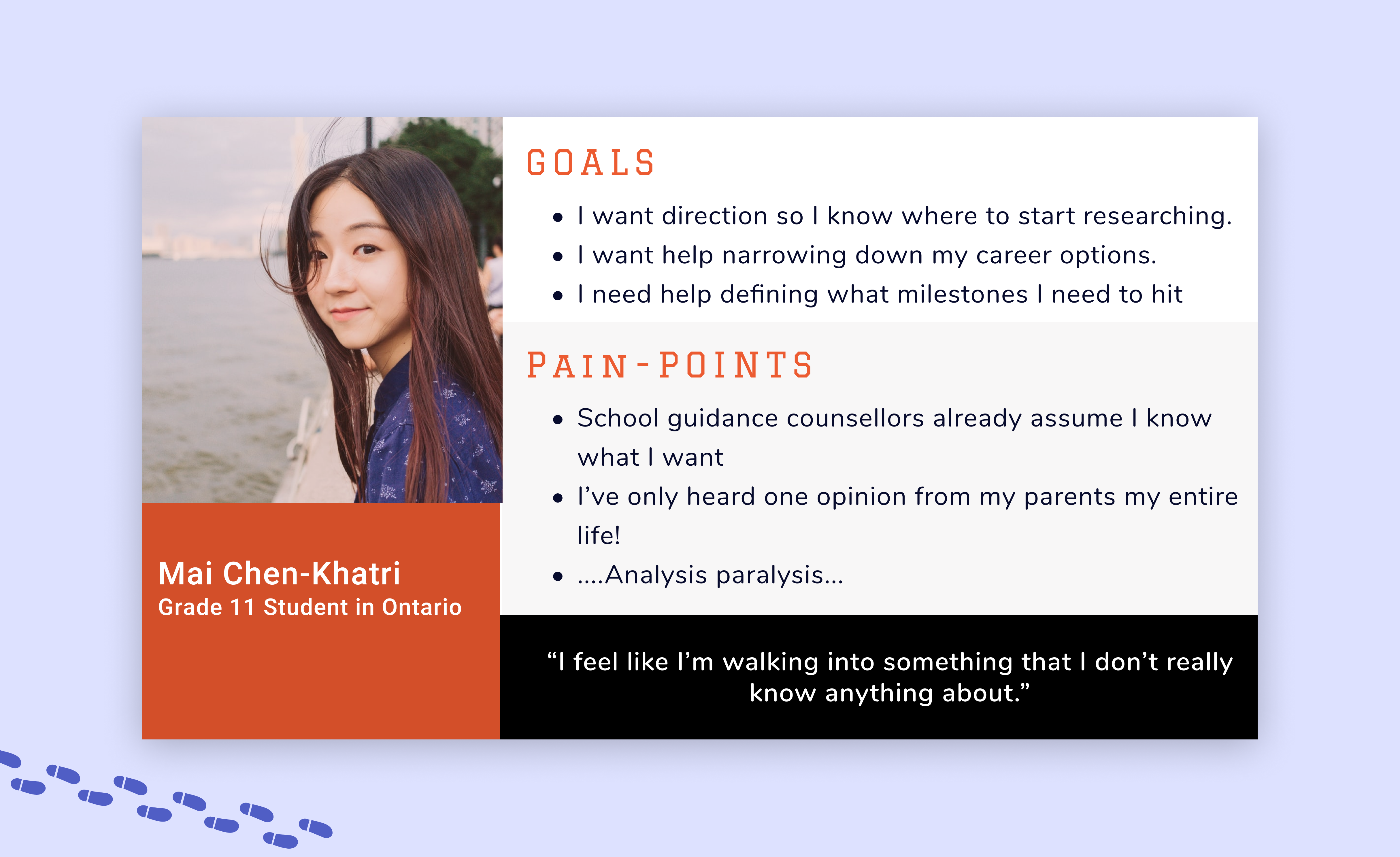
Mai Chen-Khatri was created using insights related to guidance from the interviews and survey. This is a simplified Persona - pulling out the most important parts.
Experience Map
Identifying opportunities for digital design solution
I stepped into Mai’s shoes and developed a real life scenario that a user would go through, most likely multiple times over, when choosing what programs or institutions to apply to for post-secondary. By mapping out Mai’s feelings I was able to pin-points the moments where digital interaction could produce the biggest positive impact.
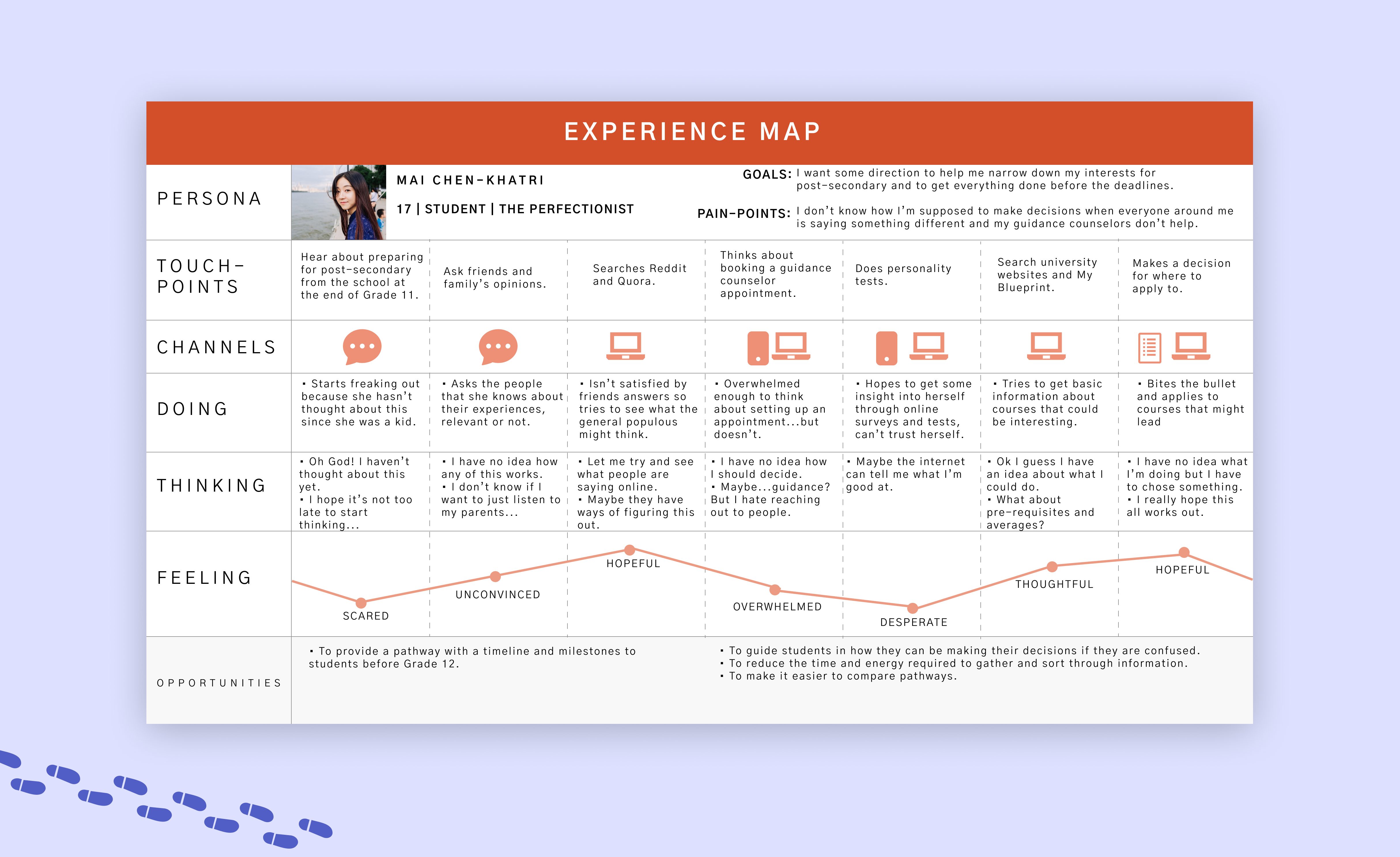
This experience map was developed based on Mai's experience trying to decide what she should pursue in post-secondary.
Key Insights
The Persona & Experience Map showed me something that I did not expect. That lack of resources, communication or information was not the problem – it was that being overwhelmed at the entire process was the major blocker.
I used this new insight to redefine my key question:
Focused Design Challenge
“How might we guide high school students to success regarding their career path by providing with personalized resources?”
Epics & User Stories
Identifying functionality through necessity
What critical function does the app need?
This application can serve many needs, simply based on our Persona, Mai. I developed her needs into user stories, to better suggest the functionalities needed to meet her requirements. The goal is to alleviate her pain-points through different functionalities or features through user stories.
I grouped similar user stories together and developed three Epics.
Gaining a Direction
"As a student, I want to have a better understanding of my options, so I can make an educated decision about my future."
Finding Information
"As a student, I want to be able to easily find information about programs or institutions, so I do not get discouraged."
Organizing Information
"As a student, I want to organize the information that I find, so that I can see the differences in programs & institutions in ways that matter to me."
Why did I choose "Gain a Direction"
The Epics are laid out chronologically, so I prioritized the first, Gaining a Direction, as it is the first step a student needs to take before they can even start dealing with comparing or organizing information.
This thought was really driven home by something I heard in one of my interviews:

Task Flow Mapping
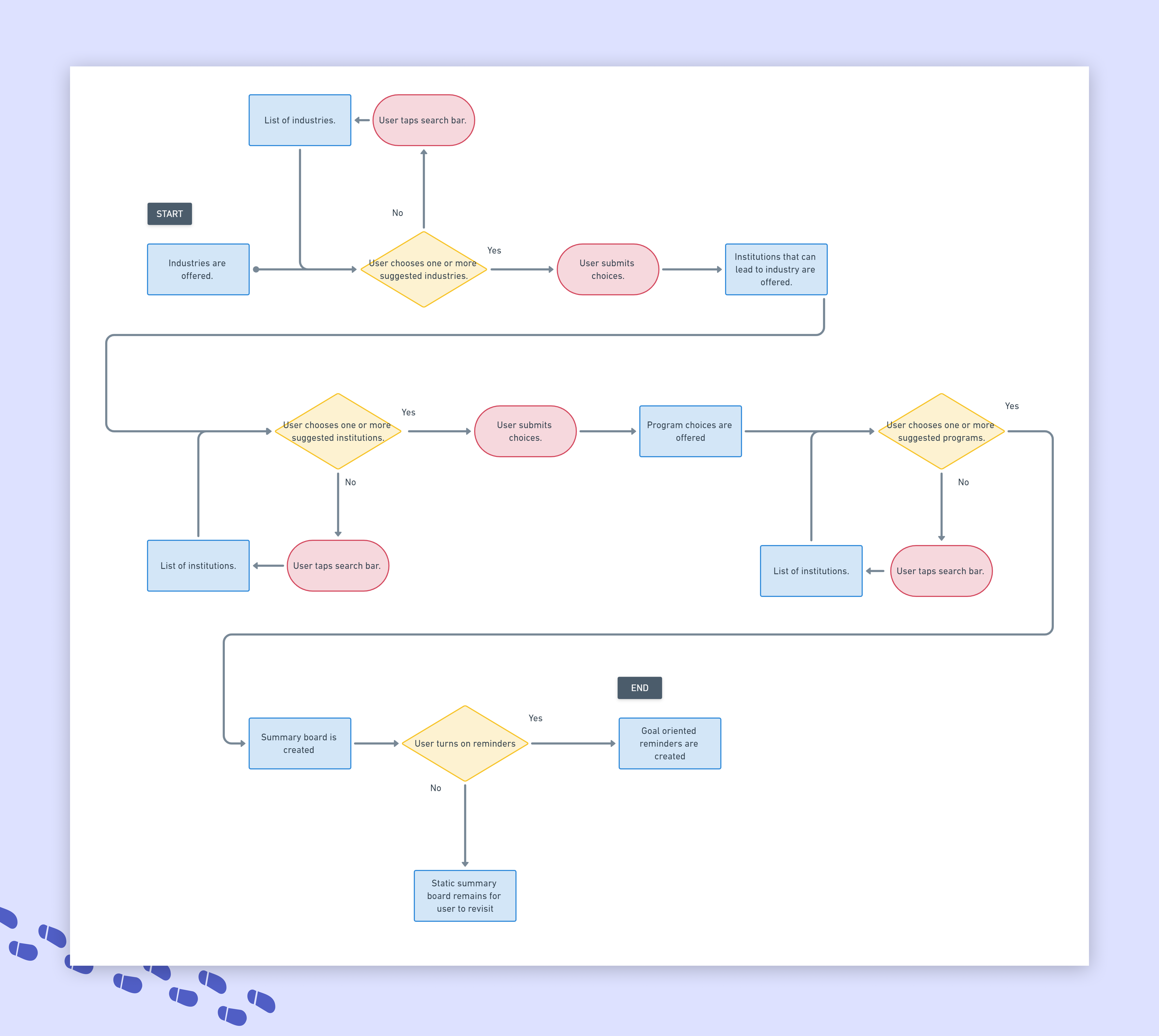
Visualizing the 'happy path' for our user
Primary Task Flow
I narrowed down the scope of the user journey to two flows, containing distinct functionalities in each.
Primary Task Flow: Student wants to get recommendations for industries or fields to go into

Secondary Task Flow
The secondary task flow follows immediately in the footsteps of the first and is based on the following user stories.
This task flow leaves the introspective space and starts to become an organizational tool. It provides the tangible outcome of the actions from the first task flow.
Secondary Task Flow: Student wants to get further recommendations for school based on career paths
Sketching
Exploring 'what could be' through sketches
Exploring inspiration
Once I clarified my main task flow, I started sketching out all the possible ways that the functionality could exist. I took inspiration from workout and quiz apps, that also had a built-in questionnaire.
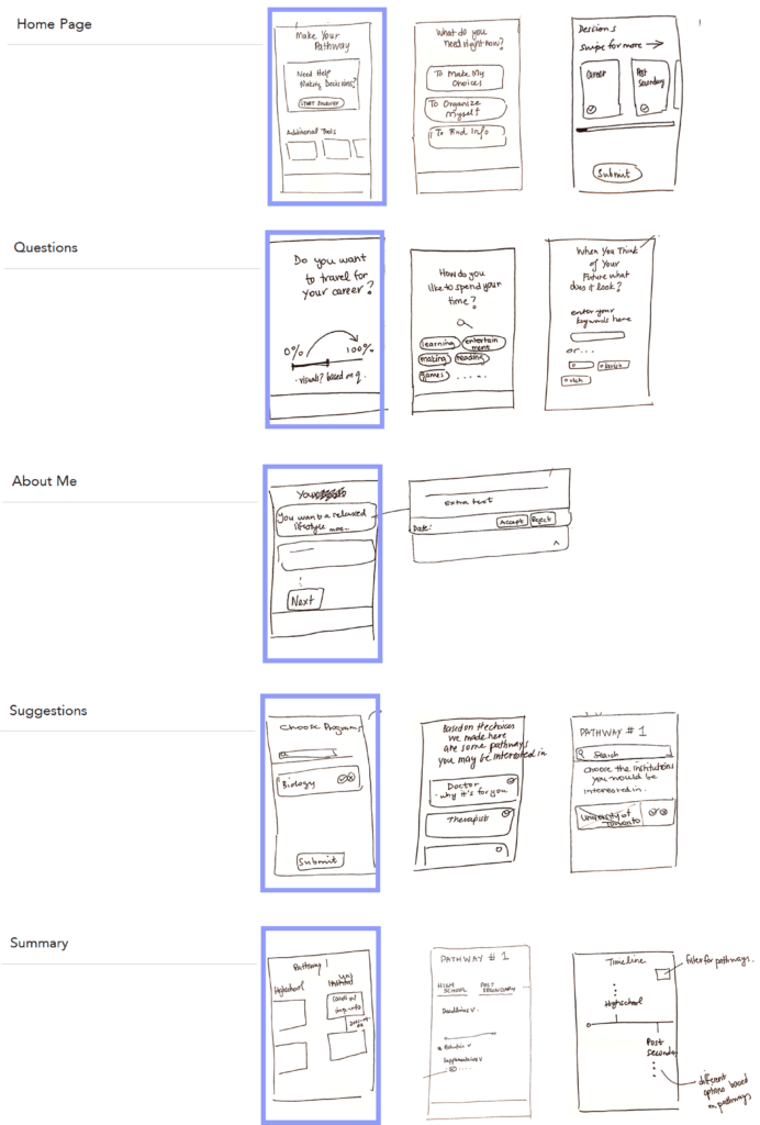
I did what I could with the sketches, to draw out as many ways as possible I could bring across the functionality that I needed:
Home Page: Showcase the many options the user has – along with a recommendation based on how much of the app they have currently used.
Questions: The bulk of the app will be introspective questions or bite-sized decisions that the user will answer.
About Me: This screen comes after all the questions that shows statements about the used based on their answers. They allow for additional insight. The user has the option to add statements about themselves.
Suggestions: At various points in the flow, the application suggests career paths, institutions and programs based on their previous choices or answers.
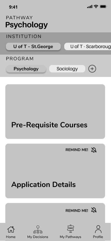
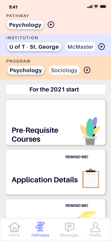
Summary: Where all career paths and connecting institutions and programs are saved. The user can see important bite-sized information about each program, like requirements, deadlines or details.
Digital wireframes
Exploring 'what could be' through sketches
Paper to digital
Using the paper prototypes to help decide on a layout, I transformed the sketches into some real grey-scale wireframes in Figma.
I made sure to include simple interactions and movements, so I could project as much function as possible before conducting usability tests.

User Testing
Using real people to tell me their real thoughts
Testing scenario
Once the ideas had gone from my head, to the paper, to the computer it was time to test them on willing participants. I set up two rounds of testing, with 5 testers in each round. I came out of testing with three sets
I gave them all the same scenario:
- You are a high school student in Grade 11 who has no clue what they want to do after high school.
- Your guidance counselor has been of no help.
- You want to do something to help you start your search
Your goal is to get career recommendations to start thinking about your decisions.
Welcome to iteration station...
There were many changes that I made after each testing round – large and small. Here I’ll go through some of the most notable changes.
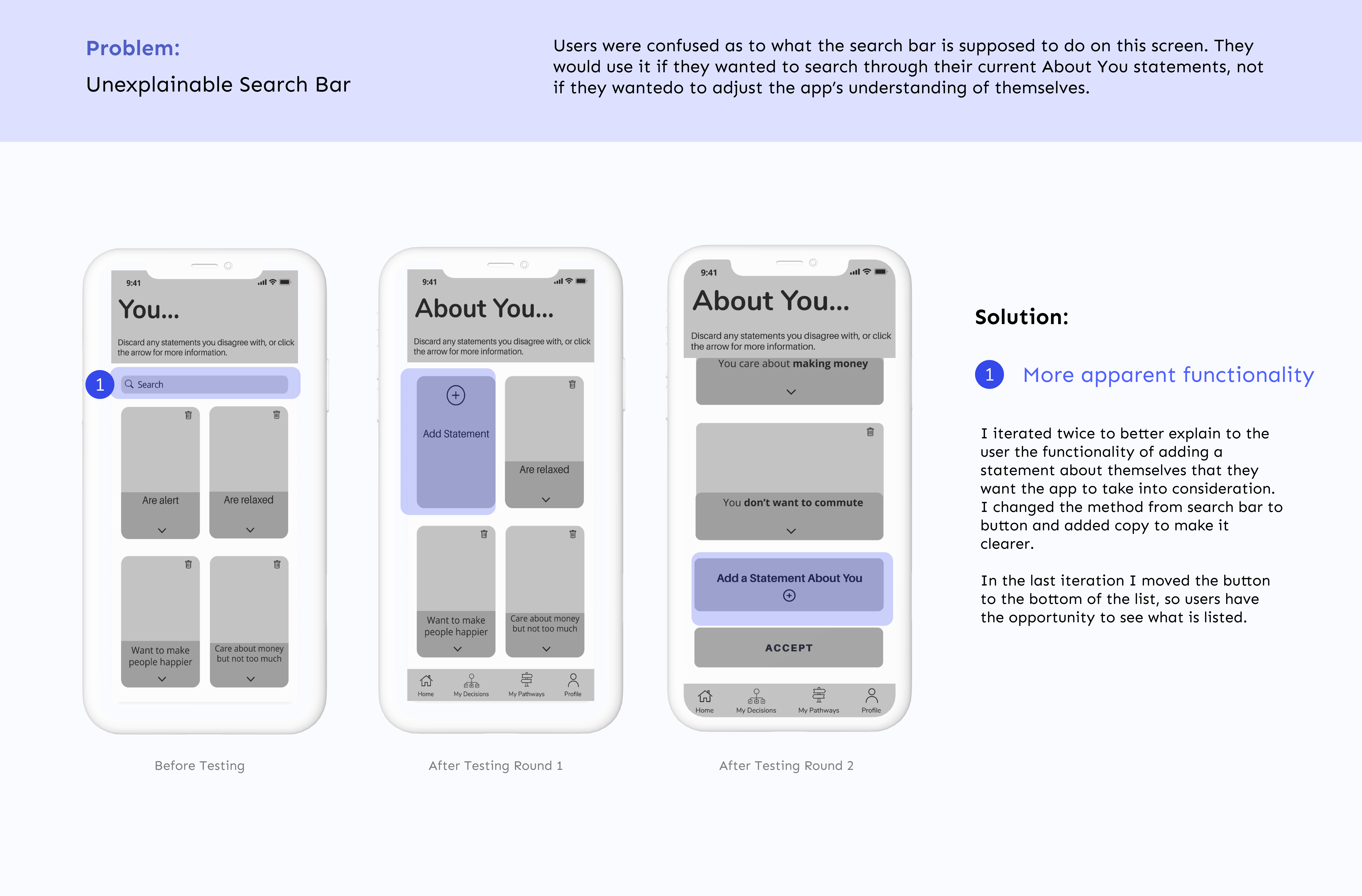
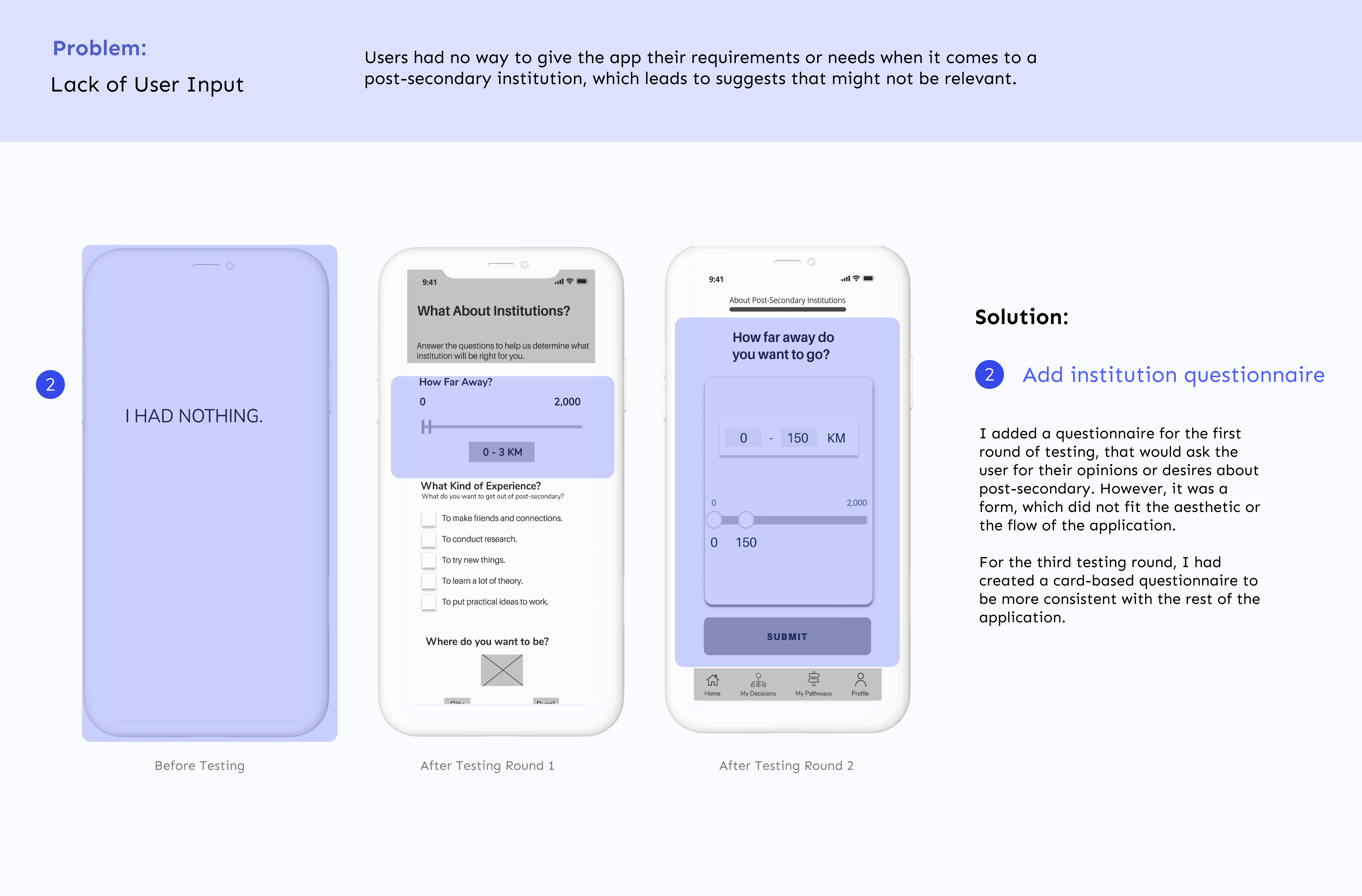
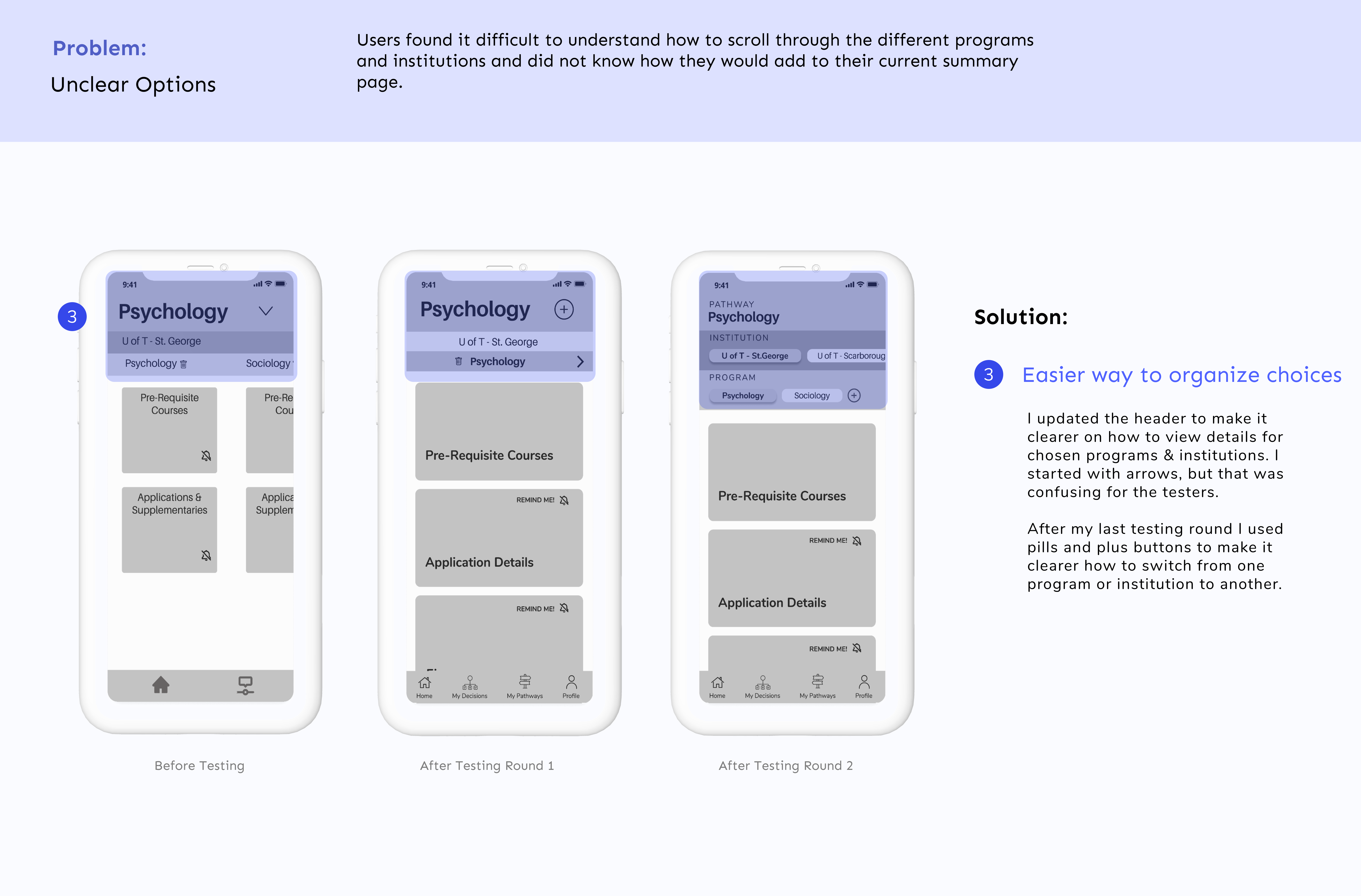
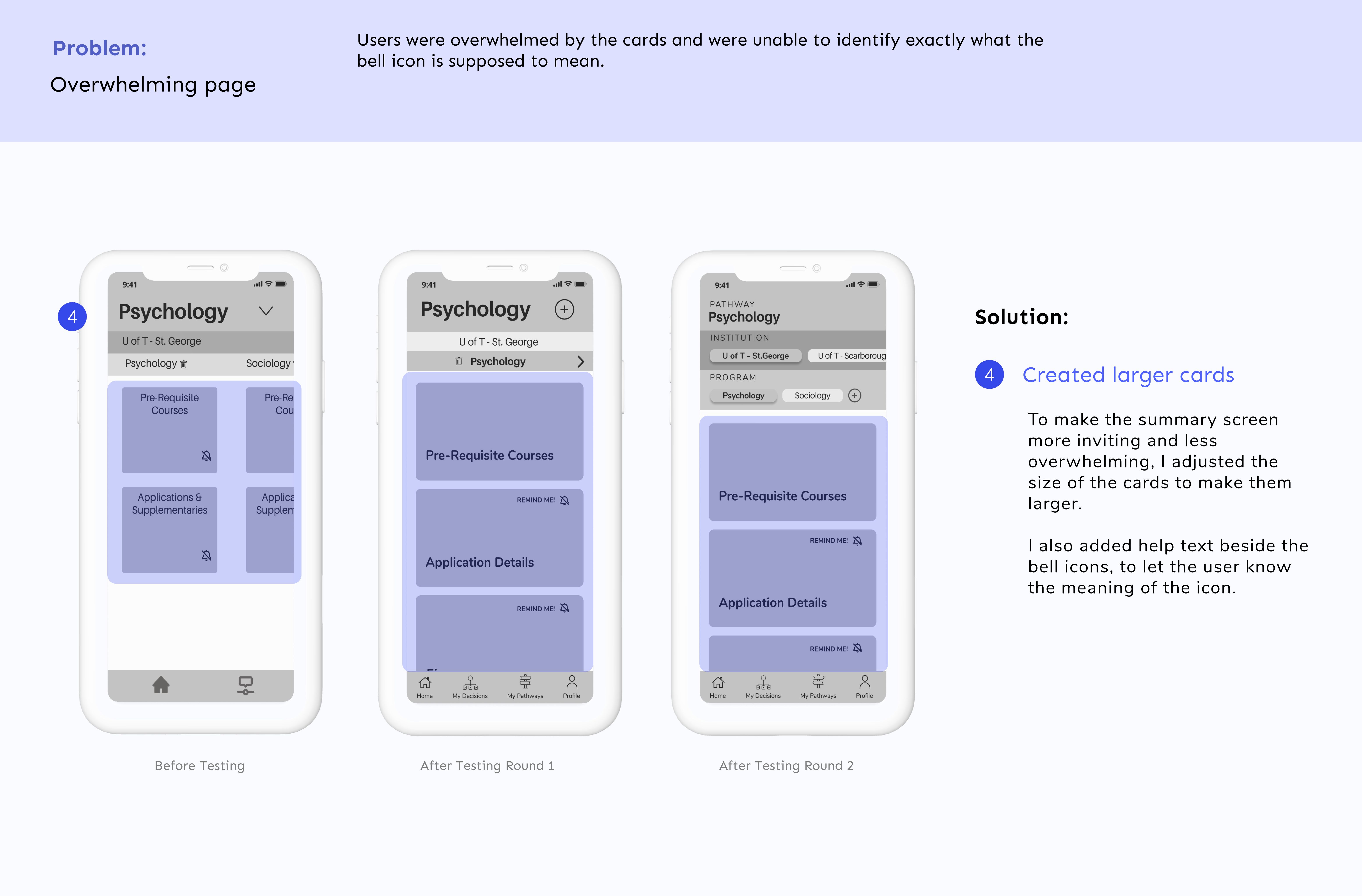
The two rounds of usability testing helped poke holes in my task flows and showed me that I had to revisit the task flow and take a moment to think about how all the information needed to be laid out on the screens.
While most of the task flow was easily navigated by the testers, I found that some of the most impactful moments – the summary and the choices – were being lost.
I feel like I could test forever, but after the two rounds I showed the final wireframe to a few users and felt confident enough to move forward for a prototype.
Brand Identity
People use things that look nice...
Setting up the feeling
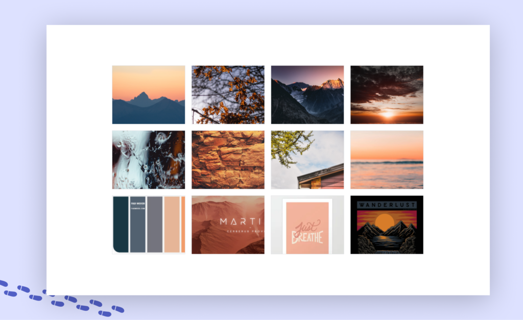
Before I started injecting colour and style into the wireframes I wanted to develop a strong brand identity that could be used to design future developments.
Current tools on the market are very professional-looking and dark. I wanted my brand to be completely different, and put the students at ease just by looking at it.
I created the following moodboard with that as my inspiration.
High Fidelity Prototype
To help you out, try Pathways
Iterate, iterate, iterate
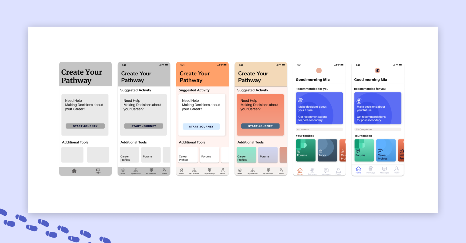
I began injecting colour into my Home Screen first, hoping that it would provide a base style that I could inject into the remaining screens.
It was disheartening to see my first attempt at injecting colour, everything appeared flat and old. So I took one night off and came back to it in the morning. I scrolled through more inspiration, found some that struck a real chord in me and buckled down to try again. The process was painful initially, but showed me that even if I create something “ugly” or “wrong” initially, it doesn’t mean that I can’t bounce back and create something I am proud of.
Bringing the application to life
I made similar changes to the other screens and found my application coming to life.
Scroll through the before and after on these screens and seen the world of difference that colour made.
Summary screen with program details
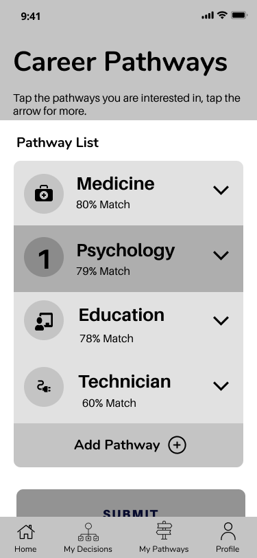
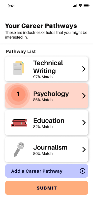
Choosing from recommendations
A Focus on a Quick and Easy Onboarding
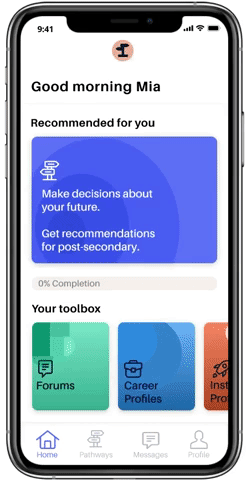
The home screen provides various tools which the user might engage with. The recommended tool on first visit is to get recommendations about post-secondary.
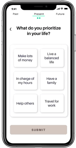
This leads into a quick and engaging onboarding, where users are brought through the three sections of questions they will need to answer.
Celebrating their Archievements with Something Delightful
Users will work through three sets of questions that ask them introspective and thought-provoking questions in a small and palatable way.
After each section is completed, the user gets a small celebration!
Giving you Options right at your Fingertips
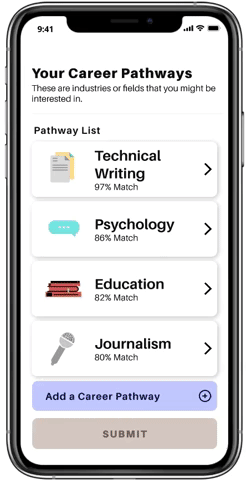
After answering all of the questions Pathways provides you with a set of career recommendations, followed by institution and program recommendations.
Altogether this leads to a simple summary, to let you keep track of all of the options that you are considering.
Success Metrics
How can I make sure that I am on the right track?
Success metrics during the design
There have been multiple moments where I developed qualitative success metrics, to validate whether I am designing something worthwhile:
- During Research Interviews, if the interviewees mention that they struggle to make decisions about post-secondary.
- During Usability Testing, if the interviewees express positive reactions to the functionality.
- During primary Desirability Testing, if the testers tell me that this application is easy and fun to use.
Success metrics 'post-launch'
These metrics, while useful for the design process, are not quantitative and therefore are hard to truly measure.
As a developed MVP, I would measure Key Performance Indicators, such as :
- User engagement, by examining specific feature usage.
- Completion Rate
- Session duration
- Number of sessions over time
Conclusion
My personal reflections of this journey
If you’re all the way here then you won’t mind sticking around to hear about everything that I’ve learned – and boy was it a lot.
YOU ARE NOT YOUR DESIGNS 🎨
The first time that someone told me that something I designed did not make sense to them, I felt like I was personally attacked. I wondered whether I was cut out to be a designer, I wondered how I could have designed something so non-functional…but after talking to my educators and classmates I realized that my experience, of having my designs questioned was the entire point!
You want to get as much feedback as possible and then use it to make your designs better. Since that first time I tried to take every bit of feedback as something positive – and not as an attack on me or my ideas.
INSPIRATION TO IDEATION 🍦
Any designer needs inspiration to develop new ideas. It took me some time to understand how to find good inspiration and not just to settle for the first few images that pop up on Google.
I realized I needed to pay attention to whether or not the designs was accessible, who the design was for and only take the parts of the inspiration that were relevant to my own design. It’s still a work in progress but I’m learning how to differentiate from good and bad inspiration and how to develop my own design from that inspiration.
Next Steps
Where could this project go?
Where could I improve...?
Though I received positive feedback from the user-base about my end product I know that there are many areas to explore to create a more robust and functional product:
- Develop questions
- Focus on an interesting and engaging experience for the students.
- Create questions that make use of multi-media (such as videos or gifs).
- Consider procedurally generated questions
- Allows the user to answer as many questions as they want (past a minimum).
- Enact a short/medium/long questionnaire choice after the onboarding.
- Develop forums for careers or fields
- Where students can discuss and message with professionals in a variety of fields.
- Develop Career Profiles
- Ask questions to students about what they would want to save
- Conduct further testing (usability + desirability).
- Existing screens
- Include the ability to quickly edit the summary section of the application.
- Include a heads up (potentially through spotlights) that users can leave the questions after each section