Shield is an application that puts credit-card safety into the hands of the users. It helps users control what websites or services store their credit card information and acts as a roadblock for suspicious credit card activity.
Synopsis
CHALLENGE
With the increase of digital online transaction, security has become a top priority for all organizations. How might we increase the security of online digital transactions for the widest range of users?
Oh, and get it done in 24 hours.
With the guidance of a team from Mastercard and BrainStation, my team designed and developed Shield, a web application that helps the user keep their credit card information safe online.
PROJECT SCOPE
We had 24 hours to design and develop a solution. Part of the challenge was to identify ourselves what scope we should work within to be successful.
The UX toolkit is vast and in its best moments makes use of primary research, however to attain results we used secondary research and insights as the basis of our design. Similarly our task flow was constrained by the time available.
Timeline: 24 hours, April 29th, 2021 – April 30th, 2021
Our methodology had to shift, not only were we working with other disciplines, but we only had 24 hours to do so. The UX team decided to condense our double-diamond process and create only the necessary artifacts. Then our designing would be done in tandem with web development.
Day 1
5:00 PM - Secondary Research
Online digital security is a massive topic. We needed to narrow down the realm of digital security we wanted to tackle.
At the same time our data science team data four datasets they could choose to parse through and collect insights. One of the datasets was a synthetic financial dataset for fraud detection.
As a team we decided to look into online fraud and see what the biggest user frustration was around fraud.
While the data science team worked with their dataset, the UX scoured the internet to see what insights we could find.
INSIGHT #1 📚
34% of survey respondents have personally experienced fraud with 18% being victims of credit card fraud and 5% victims of online fraud. [1]
INSIGHT #2 📚
Identity theft reports have gone up by about 46% for the ages of 20 - 49. [2] Having more accounts and transactions can increase the risk of identity theft.
INSIGHT #3 📚
Credit card fraud is the most common type of identity theft, followed by other and loan fraud.[2]
8:00 PM - Team Meeting
We came together to discuss the insights and brainstorm ideas. I developed a Demographic, Goals and Frustrations table so we could easily see what we were working with.
Demographic
Age 20 – 40 for identity theft
Age 70 – 79 high losses, but less frequency
Men – lose more money to scammers
Women – lose more money to scammers
Goals
Use credit cards to make online purchases safely.
Not worry about online security while purchasing new products.
Be aware of scams so I do not fall for them.
Frustrations
People opening up new credit cards in my name (new credit card fraud).
Requiring the usage of third-party money sources to protect information.
I am more vulnerable when I experience a negative life change.
Experiencing phishing through websites.
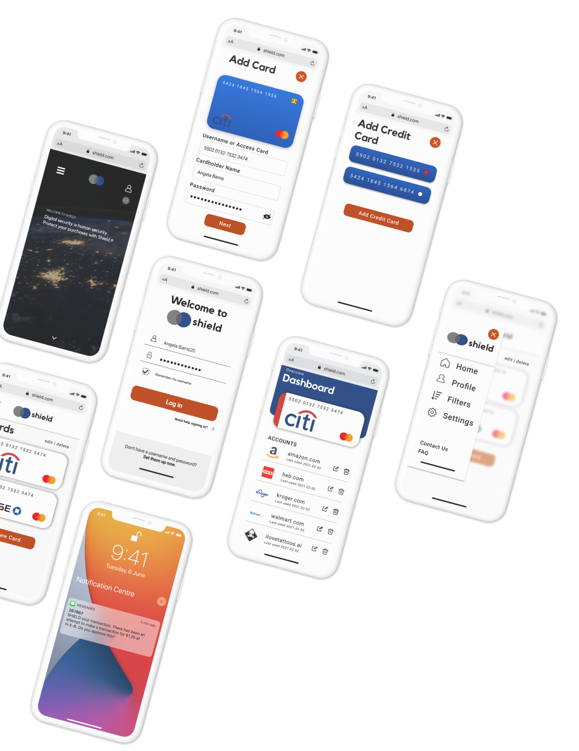
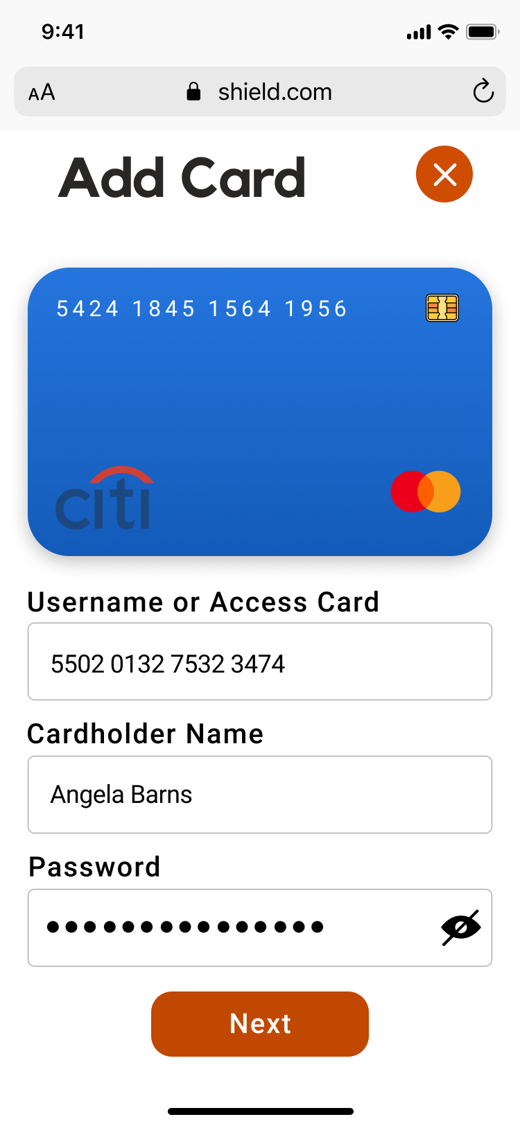
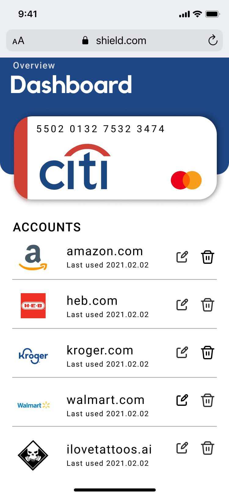
During this meeting, we decided to move forward with the idea of creating an aggregator for a user to see what accounts their credit card is associated with, then giving them the ability to adjust, edit or delete those accounts. A secondary layer of safety would be text-message based prompts when any associated credit card is exhibiting unusual activity.
Now it was time for my UX team to start developing functionality, so that the Web Development team could start developing.
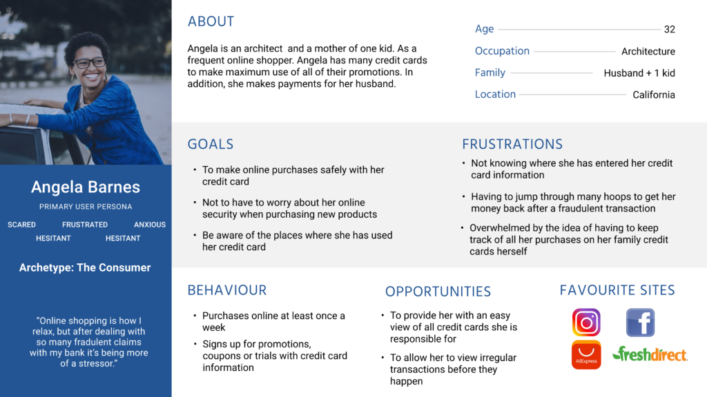
9:00 PM - Persona Development
We started by crafting a persona with the demographic insights from our secondary research. We hoped this would helps us decide what functionality is necessary and prevent us from veering off-course.
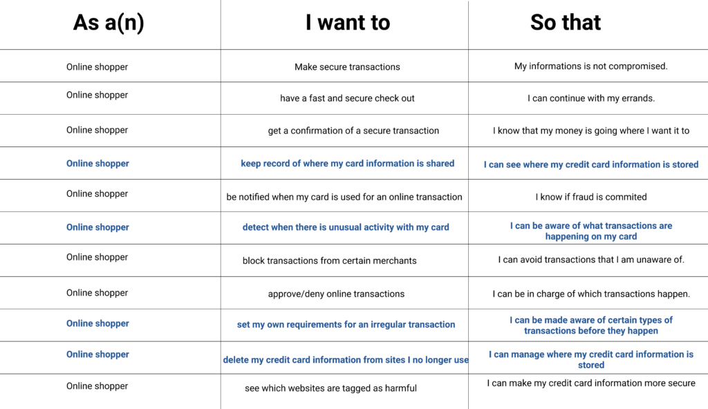
We developed a set of user stories, focused of course on credit card fraud to help identify what functionality our app could have. After some discussion we decided on the bolded blue user stories as the primary user stories.
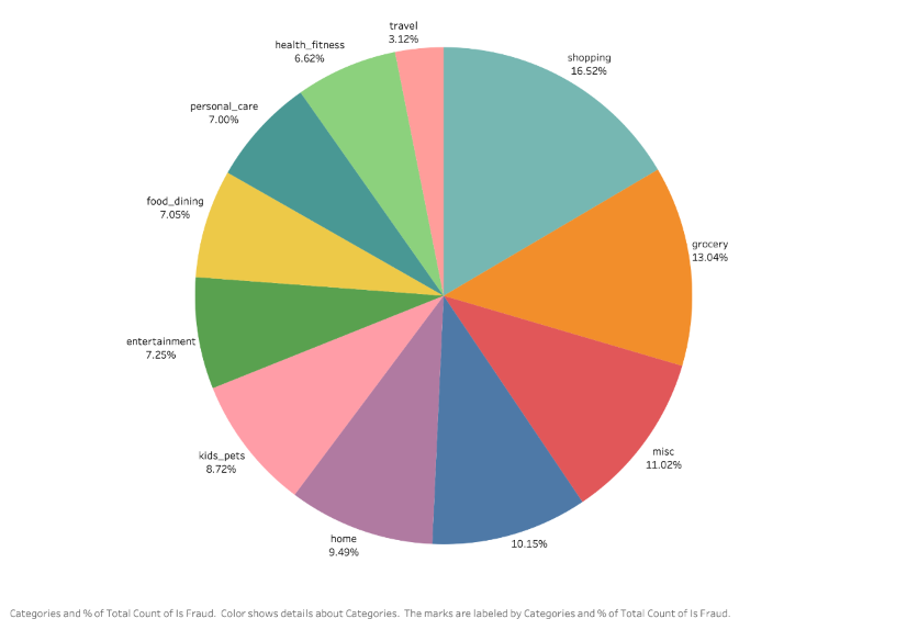
10:00 PM - Data Science Insights
At this point, we came together with the Data Science team to see what insights they acquired from the data set.
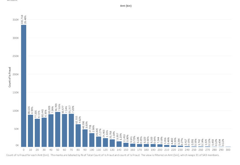
Many of their insights matched our secondary data, such as fraud being highest among women around the ages of 25 – 45. We learned two additional insights:
INSIGHT 1
That most credit card fraud occurs at shopping or grocery vendors.
INSIGHT 2
That 26% of fraudulent transactions occur for less than $10.
10:30 PM - Task Flows
Now that we had a fuller picture of what we were working with, it was time to tackle what flows we were going to create. We had to consider how long we had to design and how long our Web Development team had to develop it.
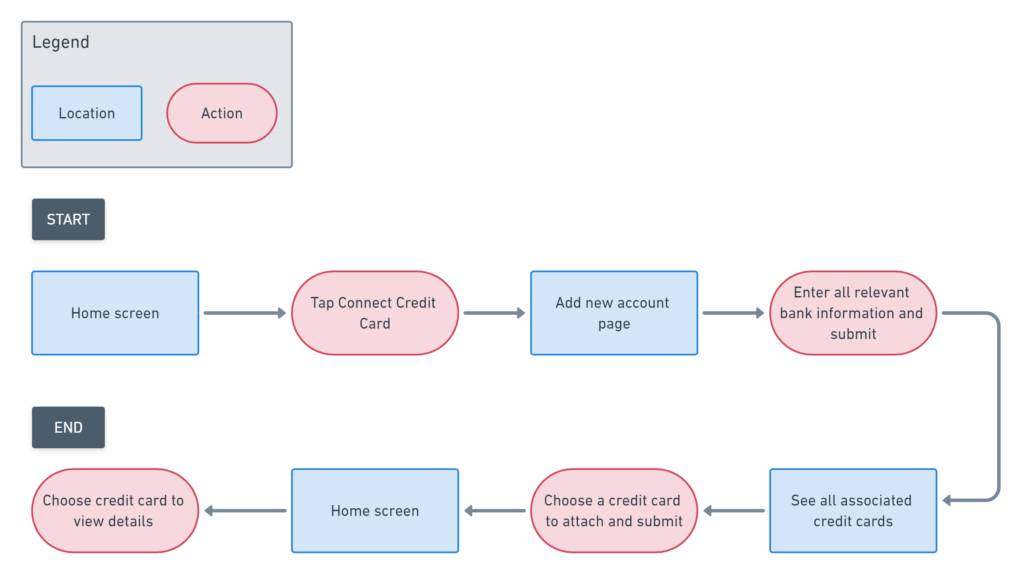
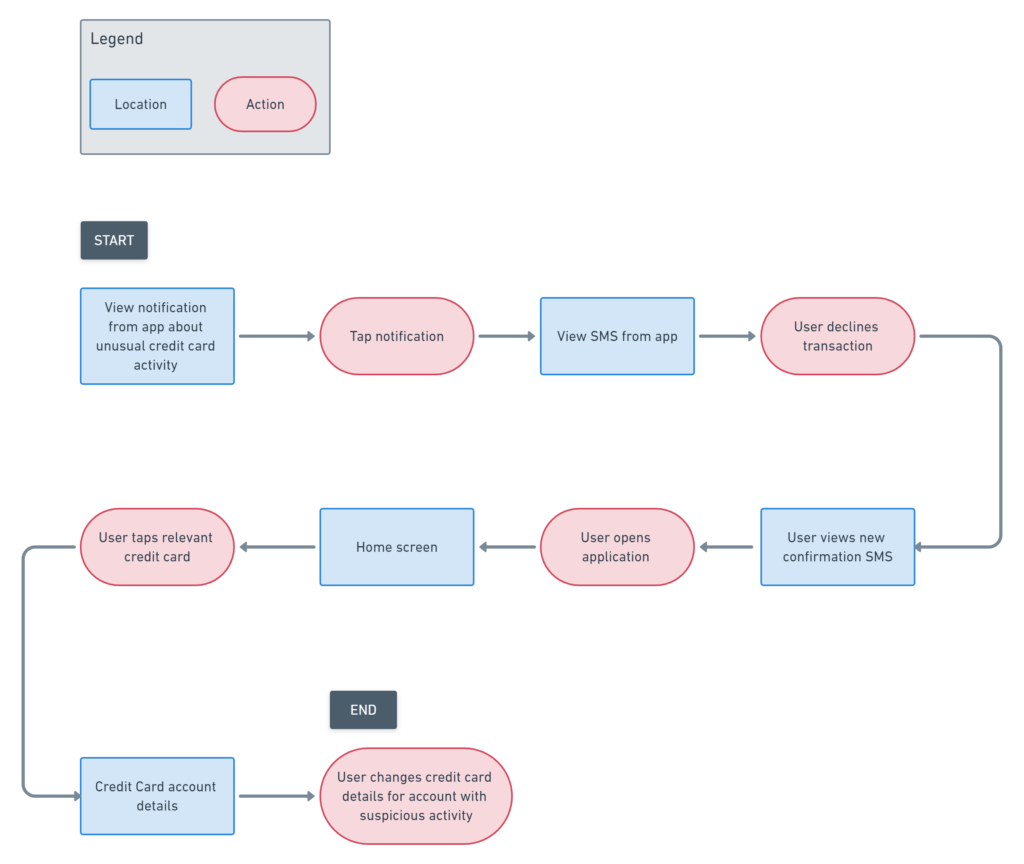
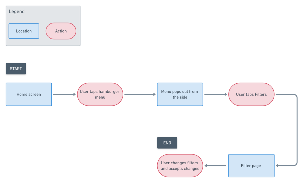
We identified three short flows that would give a viewer a good idea of what our application could do.
Flow 1 - Connect new credit card
Flow 2 - Notification of unusual activity
Flow 3 - Filter what constitutes as unusual activity
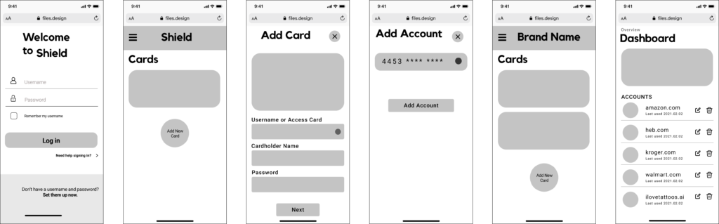
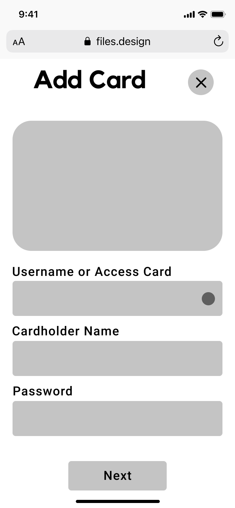
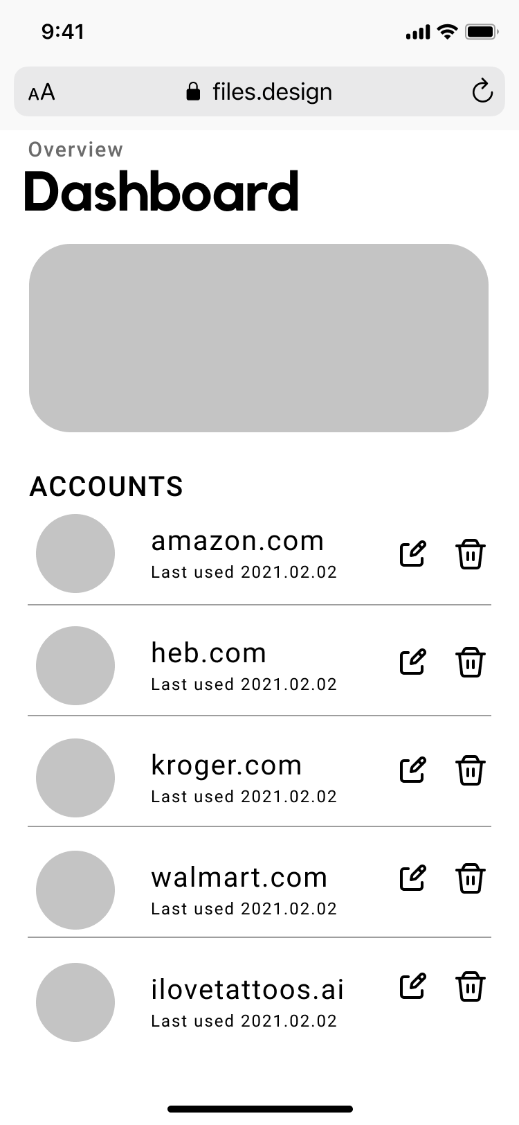
11:00 PM - Greyscale Wireframes
We whipped together a greyscale design as soon as possible so the Web Development team could start setting up.
Below is an example of greyscale wireframes for Flow 1.
2:30 AM - Sleep!
Day 2
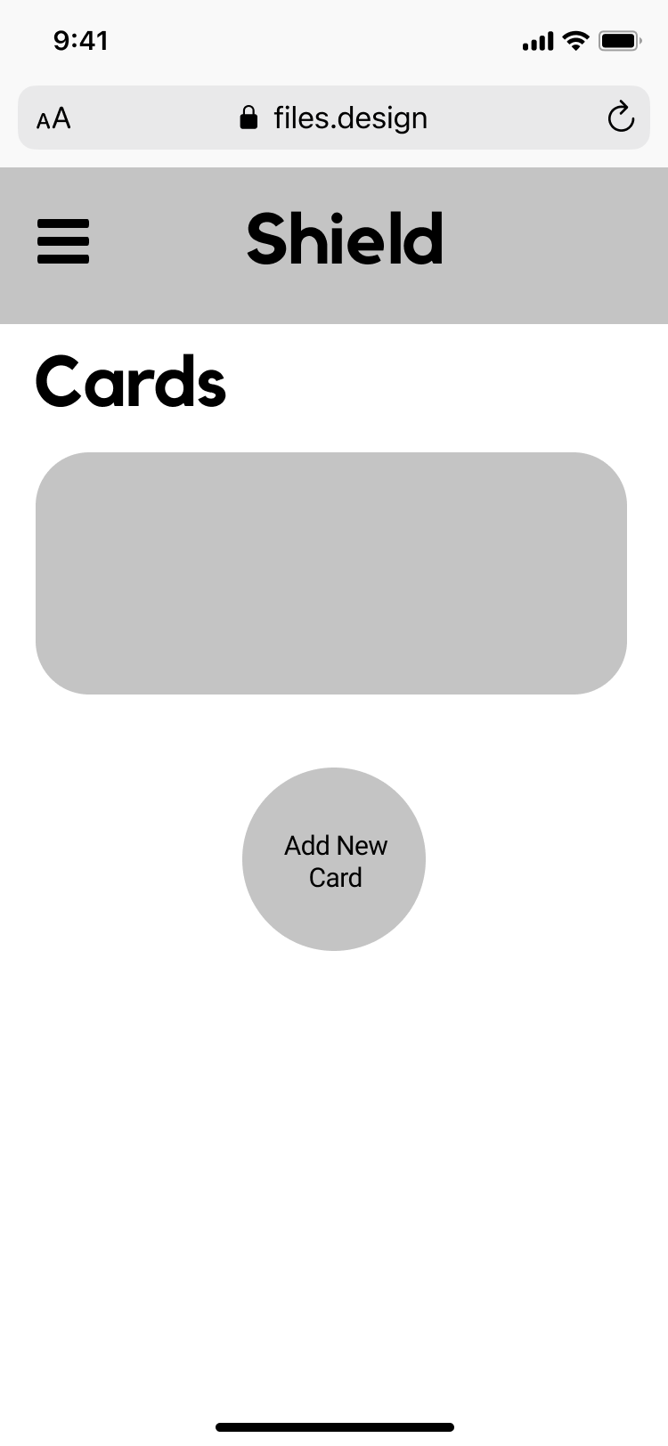
8:00 AM - High fidelity
We got started bright and early to inject colour into our designs. As we designed, our Web Development team was watching and taking the necessary components from Figma to develop our design in tandem.
Raquel and I split the screens and injected colour based on inspiration from other banking applications, such as BMO, TD and Tangerine.
We created this prototype with American banks because the data that we were using reflected American locations.
I injected colour, shadow and stroke into the following screens:
Home Screen
Add a card
Detailed accounts
12:00 PM - Stitch prototype
As our deadline quickly approached, we split our prototype into three based on our three task flows.
Of course, a fantastic design would be of no use if we were not able to convey our ideas quickly and efficiently via presentation! As my team-mates continued to clean up our high-fidelity prototypes or create mockups, I began to work on the content in the presentation.
We only had 7 minutes – when split across four disciplines it’s hard to convey all the effort and lack-of-sleep that went into the design. But we did our best!
With only half an hour left before our presentation, we had to speed-practice to make sure that we had a compelling presentation that was under 7 minutes!
4:00 PM - Presentation time!
After 24 hours of designing, developing and communicating, the entire team was happy with our final product!